Where Dusty Blue Sits Between Powder, Steel, Slate, and French Blue
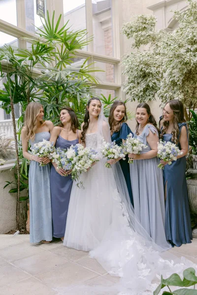
Dusty blue is a mid-tone blue desaturated with gray. It is darker than powder blue, warmer than steel blue, lighter than slate, and less vivid than French blue. Cornflower and periwinkle add violet that dusty blue does not have. The gray is the defining ingredient, and the amount of it is what every neighboring shade name is arguing about.
Naming is inconsistent across the industry, which is the practical problem. One label covers a range wide enough that a dusty blue from one collection can sit further from a dusty blue in another than it does from that same collection’s slate. Ordering by swatch rather than by name is the only reliable method, and ordering all swatches at once, in the same light, is the only way to compare them honestly.
Powder, baby, sky, and ice blue. These sit above dusty blue on the value ladder, carrying more white and less gray. Powder and baby blue read pastel and sweet. Ice blue pushes cooler with a faint silver cast. All three show construction lines, seam shadows, and pressing marks more than dusty blue does, because the paler a fabric goes the less it hides.
Steel and slate blue. Steel blue is dusty blue with the warmth pulled out, flatter and cooler, closer to gunmetal in satin. Slate carries more depth and shadow, moving toward the blue-gray of wet stone. Slate photographs as the more formal of the two and holds up better in evening light, where dusty blue starts to lose saturation.
French blue and cornflower. French blue is more saturated and noticeably more cheerful, a clean mid-blue without the gray veil. Cornflower adds a violet lift that reads almost lavender in bright sun. Both are more assertive in photographs than dusty blue, so a party in either will pull more attention away from the bridal gown.
Periwinkle, mist, and dusk blue. Periwinkle leans violet. Mist blue is dusty blue with even more gray, nearly a neutral. Dusk blue sits between dusty and slate. These three are the shades most often mislabeled, and the ones where a physical swatch matters most.
Blue-grey. When the gray outweighs the blue, the result stops functioning as a color in the palette and starts functioning as a neutral. That is useful with a mismatched party, where a blue-grey dress can act as the connective tone between two stronger blues. For the deep end of the range, navy blue bridesmaid dresses operate under different rules entirely, since navy has no meaningful gray content and behaves as a dark neutral rather than a muted color.
Why the Same Dusty Blue Looks Different in Chiffon Than in Satin
Fabric changes dusty blue more than any other variable. Lustrous weaves reflect light off the surface, which desaturates the gray and makes the shade read brighter and bluer. Matte weaves absorb light and hold the gray, reading deeper and softer. One dye, two fabrics, two visibly different colors.
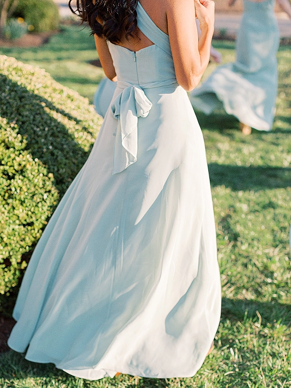
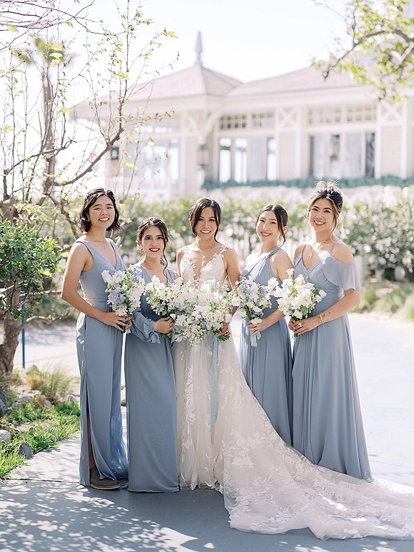
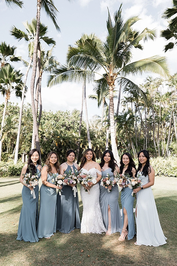
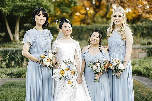
Chiffon. Matte, sheer, and almost always layered. Each layer stacks the dye, so a chiffon skirt reads deeper than a chiffon bodice built over fewer plies, and the color intensifies where the fabric gathers. Chiffon is the most common dusty blue bridesmaid fabric because the airiness suits the shade’s softness, and it moves well in outdoor photographs.
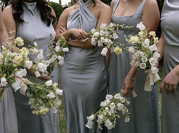
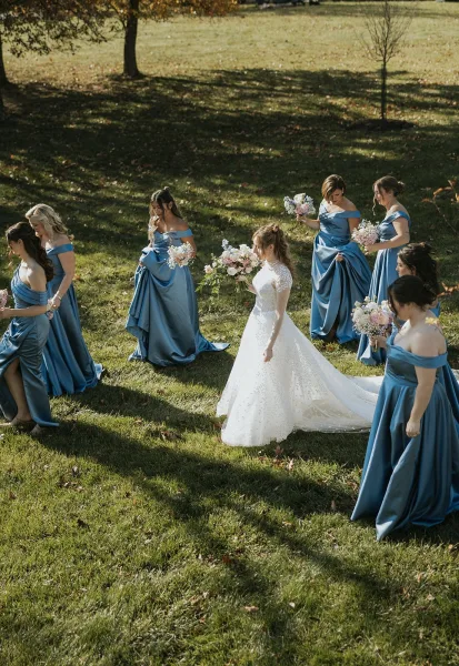
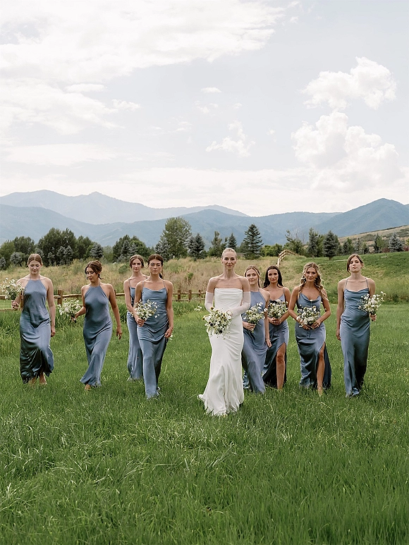
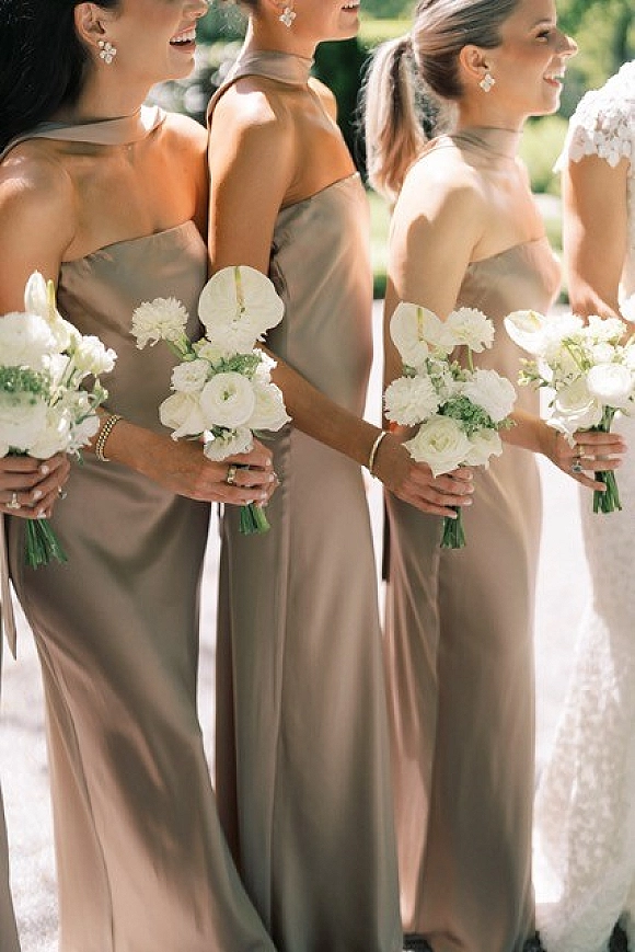
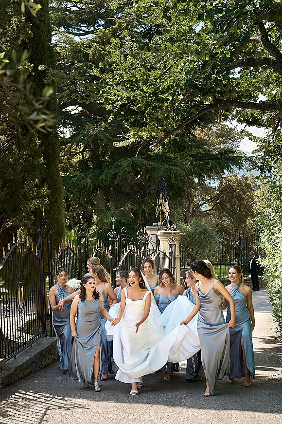
Charmeuse and matte satin. Charmeuse is fluid and highly reflective. It pools into deep folds, and the crest of each fold catches enough light to read near-silver while the trough reads slate, which gives a single dress a wide tonal range. That range is why satin dusty blue photographs as the most dimensional version of the shade, and also why it is the hardest to match across dresses in different silhouettes. Matte satin cuts the shine and lands between charmeuse and crepe.
Crepe. Matte with a fine grain, crepe renders dusty blue closest to the swatch and stays consistent under mixed lighting. It skims rather than clings, which makes it the steadiest choice across a party with a range of body types.
Velvet. Crushed pile absorbs light directionally, so the color shifts as the wearer turns. Dusty blue velvet reads considerably deeper than its swatch and often closer to slate, which makes it a cold-weather and evening fabric rather than a garden one.
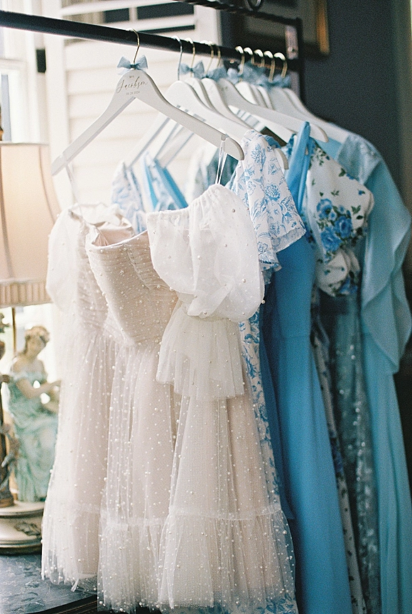
Lace and tulle. Chantilly and guipure lace over a lining in the same dye produce two tones in one garment, with the lace motif floating a shade lighter. Over a nude lining the whole dress lightens noticeably. Tulle gives the airiest, palest read of any dusty blue fabric.
Mixing fabrics across the party. A chiffon dress and a satin dress ordered in the same dusty blue will not match in photographs, and the mismatch reads as a mistake rather than a choice. Either hold the fabric constant and let silhouettes vary, or accept the fabric variation and commit to it across the whole party so the difference reads deliberate.
Dusty Blue Floral and Printed Bridesmaid Dresses
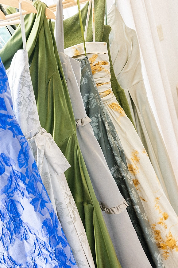
Printed dusty blue is one of the strongest sub-categories in the shade, and it solves a problem solid colors cannot: a print carries several tones at once, so it forgives the shade variation that plagues solid orders and links a party to a bouquet without demanding an exact dye match.
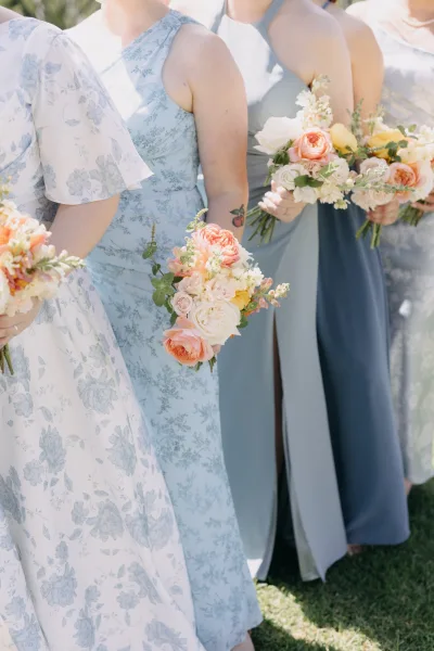
Blue on a light ground. Dusty blue florals scattered across ivory or white read fresh and garden-leaning, and they photograph brighter than a solid dusty blue because the pale ground reflects. This is the version that suits daytime and outdoor ceremonies, and the one that pairs most easily with white and ivory florals.
Light florals on a dusty blue ground. Reversing the ratio produces a moodier, more saturated dress. White, blush, or cream blooms on dusty blue hold the shade’s identity while breaking up the surface, and the effect reads closer to a solid from a distance, which keeps a large party cohesive.
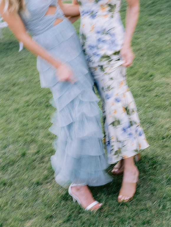
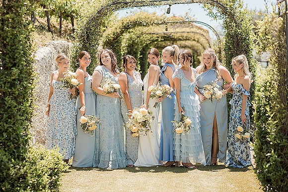
Print scale. Ditsy florals read almost as texture in photographs and behave like a solid at ceremony distance. Large-scale placement prints read as pattern and want a simple silhouette to sit on. Watercolor prints, with soft edges and bleeding tones, are the most forgiving across mixed body types because they have no repeating grid to interrupt.
Blue and white patterned dresses. Blue-and-white print has a long decorative lineage, from chinoiserie to grandmillennial styling, and a party in blue-and-white print sits comfortably in that tradition without needing the rest of the wedding to commit to it.
Mixing print and solid. One or two printed dresses among solids works when the print contains the exact solid shade. When it does not, the printed dresses read as an error. The safer version reverses it: the maid of honor in solid, the rest of the party in the print, which reads as a deliberate hierarchy.
How Dusty Blue Renders in Golden Hour, Overcast, and Candlelight
Dusty blue is more light-dependent than a saturated color, because warm light attacks the blue and leaves the gray behind. A party that looks correct at the ceremony can look like a different palette at the reception, and knowing that in advance is what lets a couple choose where the portraits happen.
Open shade and overcast. Neutral to cool light, and the truest rendering of the shade. Dusty blue in open shade looks like its swatch. This is where the color earns its reputation, and where portraits of the full party should happen if the shade itself matters to the couple.
Golden hour. Warm low sun adds yellow, which neutralizes blue and pushes the remaining gray toward green-gray. Dusty blue at sunset reads duller, warmer, and closer to sage than to blue. That shift is flattering on skin and gentle overall, but it is a real color change rather than a subtle one.
Candlelight and warm reception lighting. The warmest light a wedding day produces, and the lowest color temperature. Dusty blue loses most of its blue identity here and reads gray-taupe. Satin holds on longest, since its specular highlights stay cool. Chiffon and crepe surrender fastest.
Colored uplighting. Blue uplighting oversaturates dusty blue and destroys the muted quality that made it appealing. Amber uplighting does the golden-hour shift more aggressively. Neutral or softly warm white preserves the shade.
Reflected color from the setting. Grass and dense foliage bounce green into the fabric, cooling and greening the shade further. Stone, gravel, and sand bounce neutral to warm. A garden ceremony and a desert ceremony will not produce the same dusty blue, which is a strong argument for looking at the shade in the actual setting before ordering.
Dusty Blue Bridesmaids at a Fall Wedding
Dusty blue works for fall, and it works better than most cool colors, because the gray in it is what makes it compatible with earth tones. A saturated blue clashes against rust and copper. A grayed blue sits beside them.
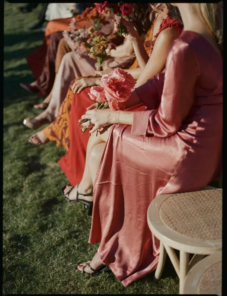
Blue and orange are opposites on the color wheel, and the muted versions of opposites read sophisticated rather than loud. Dusty blue against rust, terracotta, copper, or camel gives a palette real contrast without either side shouting. Add burgundy or plum and the palette deepens without losing the blue. Mustard and marigold are the more adventurous pairing, and they work when the blue stays on the grayer end.
Shift the fabric, not the shade. The strongest fall move is keeping dusty blue and changing what it is made of. Velvet, crepe, and matte satin with sleeves read seasonal in a way airy chiffon does not, and they hold the color better under the shorter, warmer light of a late-afternoon autumn ceremony.
Fall florals with dusty blue. Dried grasses, seeded eucalyptus, copper beech, bleached ruscus, and rust-toned ranunculus give the bouquets autumn weight while the dresses stay cool. The contrast between warm florals and cool dresses is the whole effect, so a blue-dominant bouquet undercuts it.
Adjacent warm palettes. For couples weighing the warm side of the same decision, dusty rose bridesmaid dressesoccupy the equivalent position on the pink side of the muted family, and the two shades are frequently run together in one party.
Pairing Dusty Blue With White, Grey, Blush, and Metallics
Dusty blue is a cooperative color. Its low saturation means it rarely fights an accent, and its gray content gives it more neutral behavior than a blue of the same value would have. The pairings below all hold up in photographs rather than only on a swatch board.
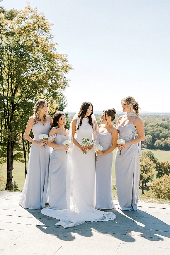
White and ivory. The cleanest pairing, and the one that keeps the bridal gown clearly separate. White florals against dusty blue dresses read crisp in daylight. Ivory softens the contrast and suits a warmer setting or a gown that is itself ivory rather than optic white.
Grey. Dusty blue already contains gray, which makes charcoal and dove grey close to tonal rather than contrasting. Grey suiting is the most reliable menswear pairing for exactly this reason. Grey bridesmaid dresses alongside dusty blue produce a quiet two-tone party that photographs as one palette.
Blush and dusty rose. The warm counterweight, and the most-requested pairing in the muted family. Blush lifts dusty blue without brightening it, and the two shades share the same gray-softened quality, so neither reads more saturated than the other.
Sage and eucalyptus green. Both dusty blue and sage are built on gray, which is why they sit together so easily and why the golden-hour shift toward green-gray reads as intentional in this palette. Sage green bridesmaid dresses run alongside dusty blue in a two-color party more often than any other combination.
Metallics. Silver and pewter reinforce the cool cast and keep the palette unified. Champagne and antique gold warm it and add contrast. Rose gold reads distinctly pink against dusty blue, which works when blush is already in the palette and looks accidental when it is not.
Across the whole palette. For couples building the shade into the tablescape, stationery, and florals rather than only the dresses, a dusty blue wedding palette carries the color through the full celebration.
Building a Tonal Palette From Several Shades of Blue
Running three or four blues in one party is the strongest use of dusty blue, because the shade sits in the middle of a range that has unusually many named neighbors. The rule that makes it work is value proximity: keep the shades within a narrow lightness band and the party reads as one deliberate gradient.
Which shades group well. Dusty blue, slate, French blue, and powder blue span a workable range. Adding steel or mist extends it without breaking it. Jumping to navy breaks it, because navy’s value sits far darker than the rest and the eye reads it as a separate color rather than another step in the ladder.
Vary one thing at a time. If the shades differ, hold the fabric constant so the surfaces behave alike. If the fabric differs, hold the shade constant. Varying both at once produces a party that looks unplanned rather than mixed.
Arranging the lineup. A strict light-to-dark order photographs as a gradient and can read stiff. Alternating so no two adjacent dresses share a value is more natural. What to avoid is accidental clumping, where the three palest dresses end up together and read as a gap in the line.
Two-tone parties. Two shades split evenly, or one shade for the maid of honor against another for the party, gives the structure of a tonal palette with far less coordination. Dusty blue with slate is the most reliable version, since the value gap is visible without being abrupt.
Letting the party choose. Giving bridesmaids a set of approved blues works when the set is genuinely narrow and every option comes from the same fabric family. For the full range of approaches to a non-uniform party, mismatched bridesmaid dresses covers the method rather than the color.
Necklines, Sleeves, and Lengths for a Dusty Blue Gown
Silhouette decisions interact with the shade, because dusty blue’s mid value hides construction better than a pastel and worse than a dark. That puts it in a comfortable middle: seams and boning do not telegraph the way they do in powder blue, and the color still shows the shape of a well-cut bodice.
Cowl and draped necklines. A cowl in charmeuse pools light at the collarbone and puts the shade’s full tonal range on display, from near-silver at the fold crests to slate in the shadows. This is the neckline that best demonstrates why satin dusty blue photographs as dimensional.
One-shoulder and asymmetric. A single strong diagonal gives a solid dusty blue dress the visual interest the muted color does not supply on its own, which is why one-shoulder is so common in this shade.
Sleeves. Long chiffon bishop sleeves suit the shade’s softness and give a garden ceremony coverage without weight. Flutter and cap sleeves keep the airiness. Long sleeves in crepe or velvet read formal and seasonal. Sleeves are also the most requested modification in this color, since dusty blue skews toward outdoor and cooler-weather weddings where bare shoulders are a practical question.
Strapless and structured. A strapless dusty blue bodice needs boning or a structured interior to hold its line, particularly in fluid charmeuse, which has no body of its own. Without that structure the neckline drops and the color pools where it should sit flat.
Lengths. Floor length is the default and the most requested. A midi or tea length reads more relaxed and suits daytime and garden settings, and the shorter hem shows more shoe, which raises the shoe decision. Short dresses work for informal celebrations, and a dusty blue jumpsuit gives one member of the party a distinct role without leaving the palette.
Across a range of body types. Crepe and matte satin skim and stay consistent. Chiffon with a full skirt gives movement and forgives fit variation between sizes. An empire waist in chiffon accommodates a pregnant bridesmaid within the same shade and fabric family as the rest of the party. When sizes vary widely, holding one fabric and letting necklines differ keeps the party unified while letting everyone wear something that fits properly. Comparing cuts across a range of labels is easiest through the bridesmaid dress vendors in the directory.
Flowers, Suits, and Shoes for a Dusty Blue Party
The accessories decision around dusty blue comes down to one question: warm or cool. Cool accents keep the palette unified and quiet. Warm accents create contrast and energy. Mixing them without a plan is what produces a party that looks assembled from separate ideas.
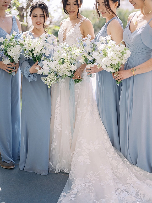
Bouquets. White garden roses, ivory lisianthus, and blush ranunculus are the safest and best-photographing partners, because the contrast against dusty blue is one of value rather than hue. Blue thistle, delphinium, and anemone with dark centers add cool tones without matching the dresses exactly. Dusty miller is the strongest greenery here, since its gray-green echoes the gray in the dress and ties the two together. Silver dollar eucalyptus and olive do similar work. What to avoid is an all-blue bouquet against blue dresses, which flattens both. Blue hydrangea wedding bouquets are the exception, since hydrangea carries enough green and violet within a single head to stay distinct from the fabric.
Groomsmen suiting. Charcoal and light grey are the most reliable, because dusty blue already contains gray and the pairing reads intentional. Tan and camel warm the palette for an outdoor or spring celebration. Brown suiting works for fall alongside the rust-and-blue palette. Navy requires care: both are blue, so the two need enough tonal separation to read as contrast rather than a failed match, and a mid navy against dusty blue often reads as neither. Black works for a formal evening wedding, where dusty blue has already shifted gray under warm light anyway.
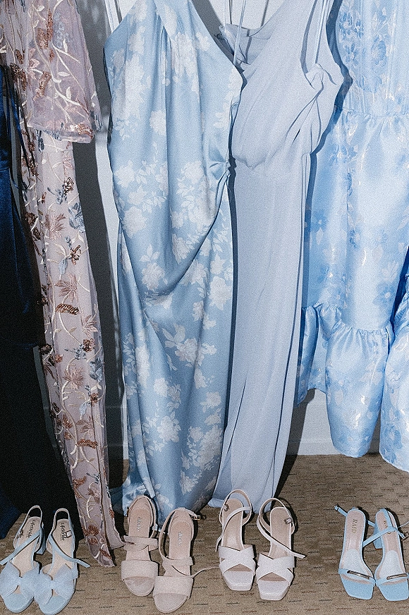
Shoes. Metallic champagne and silver are the workhorses and photograph well against the shade. Nude in each wearer’s own undertone disappears, which is the point when the dresses are floor length. Ivory satin reads dressier. Cognac and tan suit an outdoor ceremony with a shorter hem. A tonal dusty blue shoe is the boldest option and works when the hem is short enough for it to be seen and read as a choice.
Jewelry and hair. Silver, pewter, and pearl sit more comfortably against dusty blue than yellow gold, and pearl in particular reads well against the gray cast. Yellow gold works when champagne or antique gold is already in the palette. Soft romantic hair suits the shade’s muted quality, and cool-toned makeup keeps the party consistent. For the wider party, dusty blue extends easily to mothers and flower girls, since the shade’s neutrality means a deeper slate for a mother and a paler powder blue for a flower girl still read as one family. Coordinating the florals against the exact dye is a conversation worth having early with the wedding florists in the directory.
Frequently Asked Questions
What color suit goes with dusty blue bridesmaid dresses?
Charcoal and light grey are the strongest pairings, because dusty blue contains gray and the match reads deliberate. Tan and camel warm the palette for outdoor and spring weddings, and brown suits a fall celebration. Navy needs enough tonal separation from the dresses to read as contrast rather than a near-miss. Black suits a formal evening wedding.
Is dusty blue the same as slate blue or steel blue?
No. Slate is darker and deeper, closer to wet stone. Steel is cooler and flatter, with the warmth pulled out. Dusty blue sits between them in value and carries a softer gray. Labeling varies enough between collections that a physical swatch is the only reliable way to compare, and swatches should be viewed together in the same light.
Will dusty blue dresses ordered in different fabrics match?
Not visibly. The same dye reads brighter and bluer in satin, which reflects light off the surface, and deeper in chiffon, which absorbs it and stacks the color across layers. Holding one fabric across the party and letting silhouettes vary is the reliable approach. If fabrics do vary, vary them across the whole party so the difference reads as a choice.
Can dusty blue bridesmaid dresses work for a fall wedding?
Yes, and the gray in the shade is why. Dusty blue sits beside rust, terracotta, copper, camel, and burgundy without clashing, where a saturated blue would fight them. The strongest approach keeps the shade and changes the fabric, moving to velvet, crepe, or matte satin with sleeves rather than airy chiffon.
What flowers pair with dusty blue bridesmaid dresses?
White garden roses, ivory lisianthus, and blush ranunculus give value contrast that photographs cleanly. Blue thistle, delphinium, and anemone add cool tone without matching the fabric exactly. Dusty miller is the best greenery match, since its gray-green picks up the gray in the dress. An all-blue bouquet against blue dresses flattens both.
What color shoes work with a dusty blue bridesmaid dress?
Metallic champagne and silver photograph well and suit the shade's cool cast. Nude in each wearer's own undertone is the quietest option and the right one under a floor-length hem. Ivory satin reads dressier, and cognac or tan suits an outdoor ceremony with a shorter dress. A tonal dusty blue shoe works when the hem is short enough to show it.