What Mismatched Actually Means: The Four Approaches
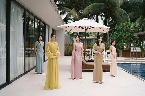
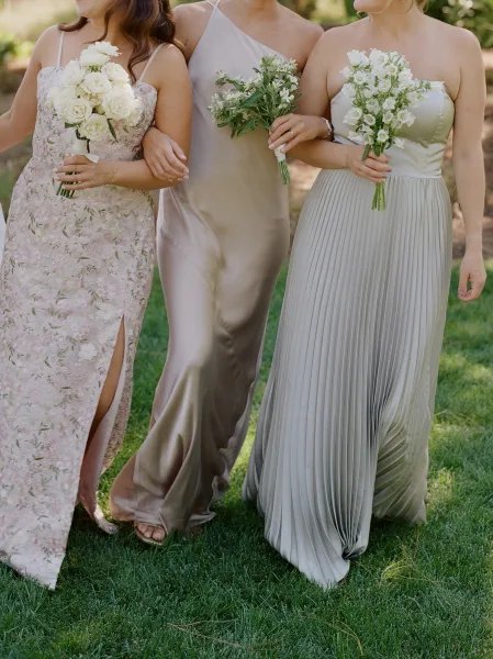
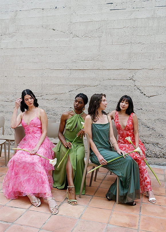
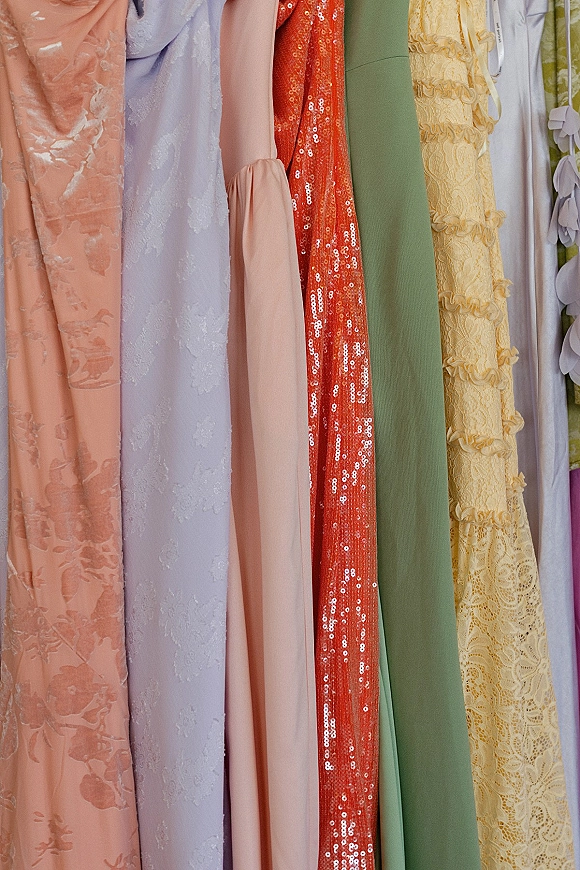
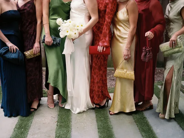
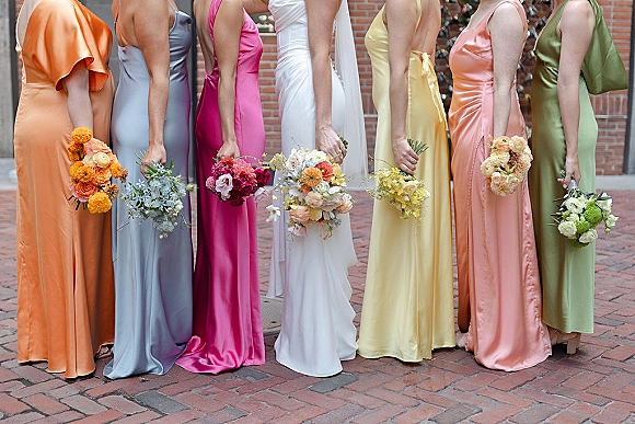
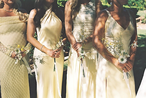
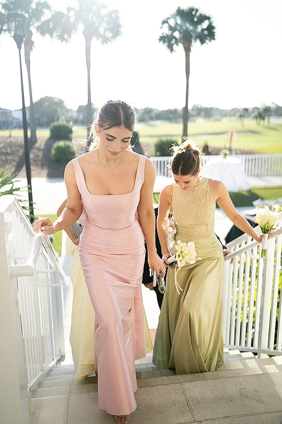
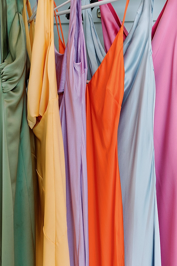
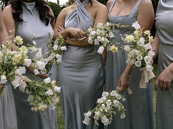
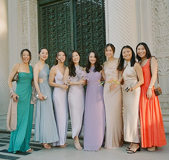
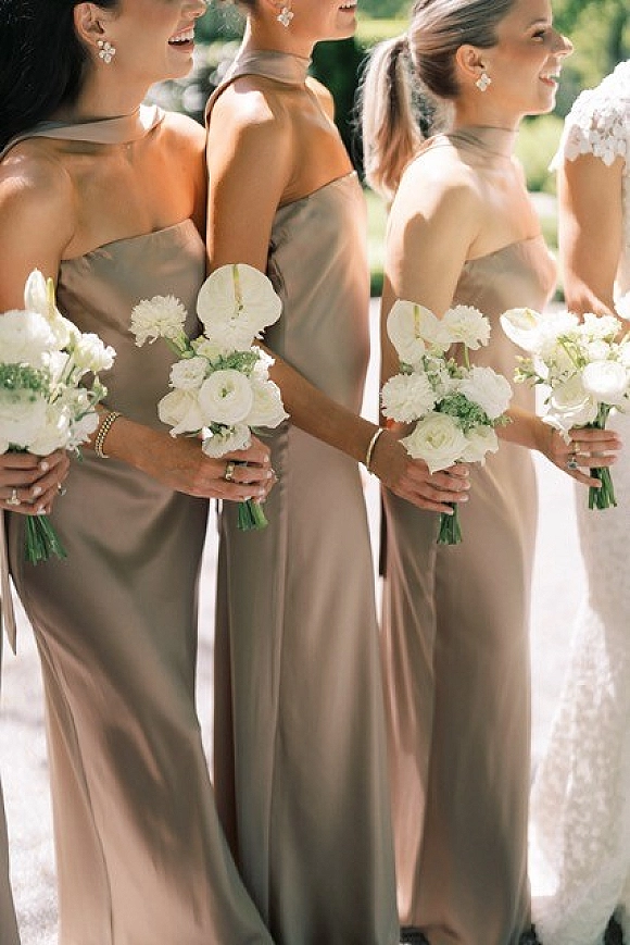
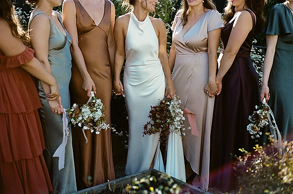
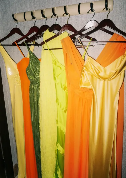
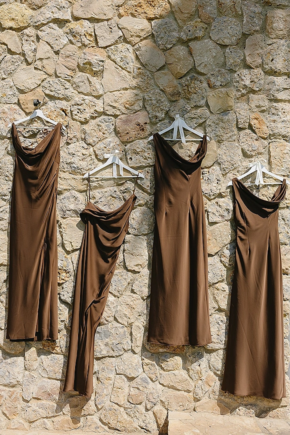
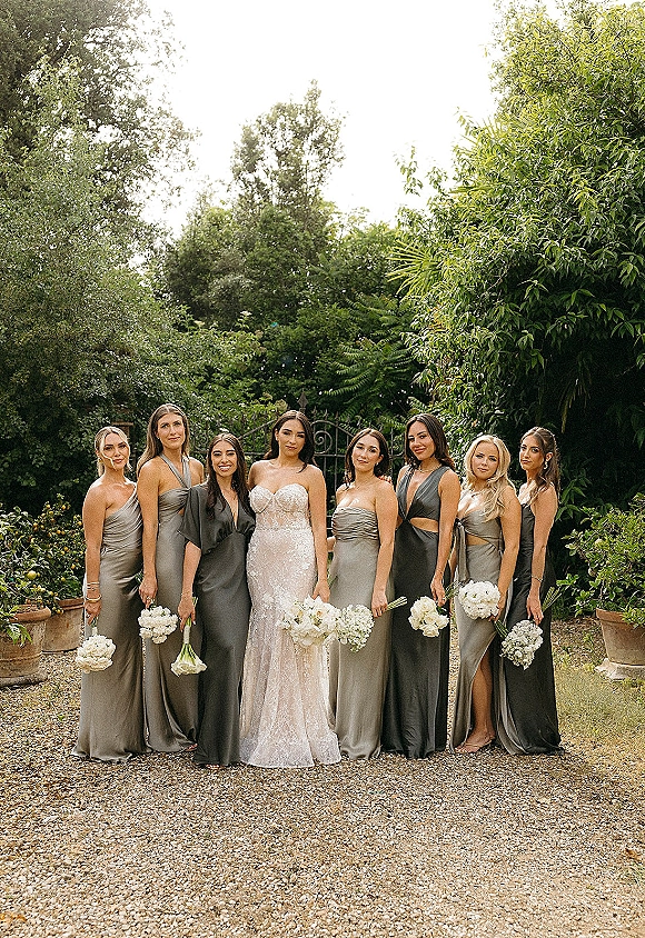
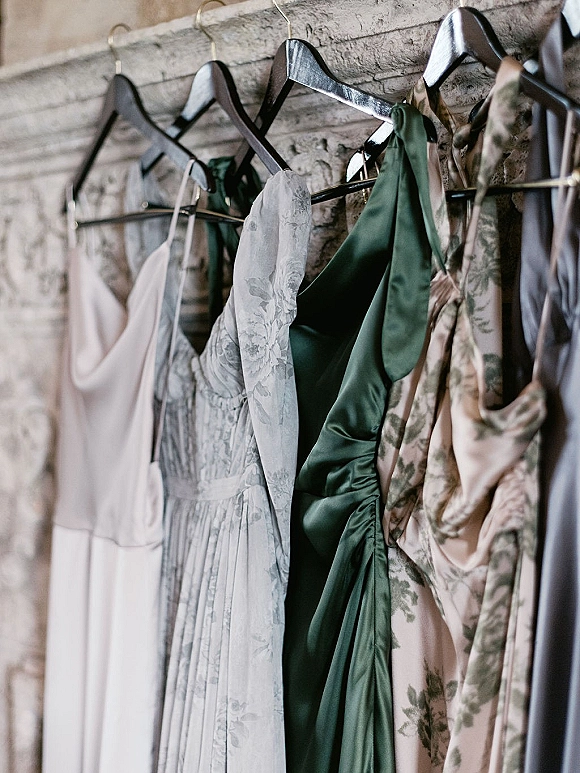
Mismatched does not mean uncoordinated. It means introducing variation along one or more axes while keeping the party cohesive, and there are four main approaches. Same color, different styles holds one shade across the party while each bridesmaid chooses her own silhouette. Different shades of one color moves through a tonal range, such as light to deep blue. Different colors in one palette uses several complementary hues. And mixed fabrics or prints varies texture, pairing solids with florals or combining chiffon, satin, and velvet.
Most parties use a combination of these. The most common and most foolproof is same color, different styles, because the single shade guarantees cohesion while the varied cuts flatter different body types. The boldest is different colors in one palette, which requires the most planning to keep balanced. Understanding which axis you are varying is the key to a mismatched party that looks intentional.
Building a Cohesive Color Palette
The foundation of any mismatched party is the palette. The reliable method is to choose two to four colors that share an undertone or a level of saturation, so they read as a family rather than a clash. Soft, muted palettes pair dusty tones together; rich palettes group jewel tones; earthy palettes combine warm neutrals. The number of bridesmaids matters too: a smaller party can carry distinct colors, while a larger party often looks best repeating a few shades across the group.
The single most important rule is to keep at least one element consistent across every look, whether that is the color family, the fabric, the dress length, or the designer line. That shared thread is what turns a collection of different dresses into a coordinated party. Without it, the lineup reads as individuals rather than a group.
Mismatched by Color: Blue, Green, Pink, and Champagne Palettes
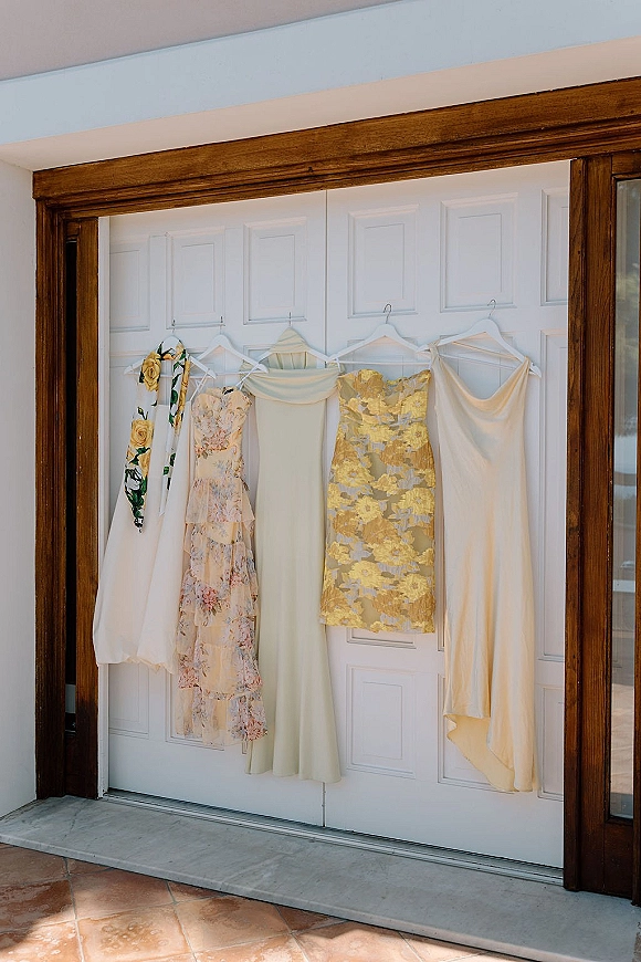
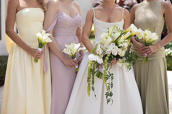
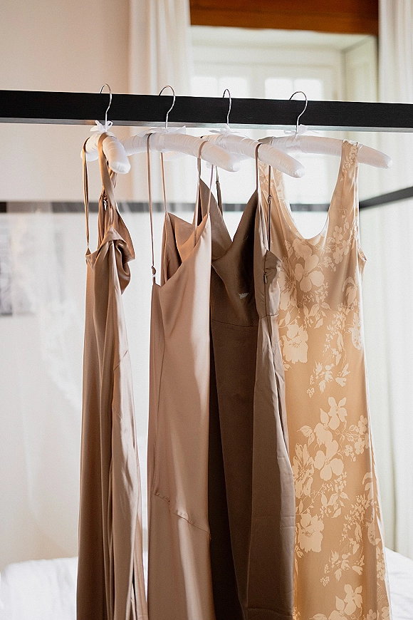
Many parties build their mismatched palette around a single color family, mixing shades within it. A blue palette might move through dusty blue, slate, and navy; a green palette through sage and emerald; a pink palette through blush, dusty rose, and mauve. Champagne and neutral palettes layer warm neutrals for a soft, undyed look. This tonal approach is the easiest entry point to mismatched because the shared base color does the coordinating work.
Each of these directions has its own galleries to draw from. For a blue party, see dusty blue bridesmaid dresses and navy blue bridesmaid dresses; for green, emerald green bridesmaid dresses and sage green bridesmaid dresses; and for soft pink and neutral palettes, blush bridesmaid dresses and champagne bridesmaid dresses.
Mismatched Florals and Prints
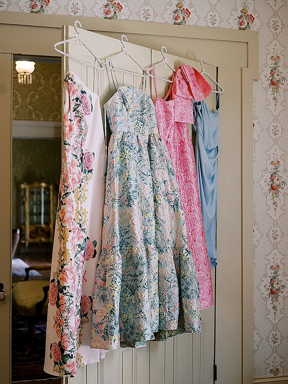
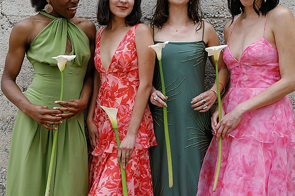
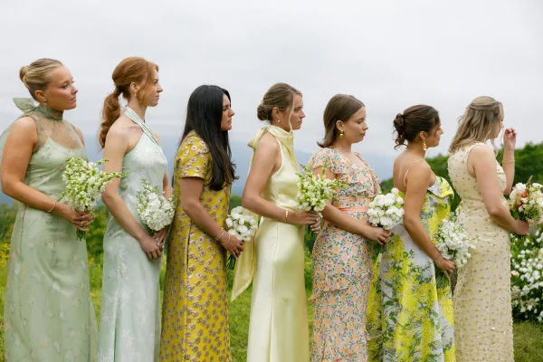
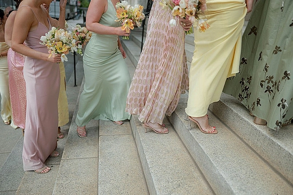
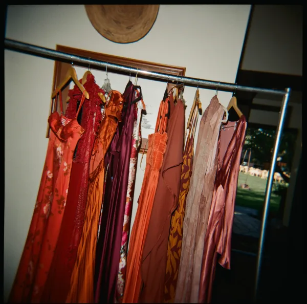
Mixing prints with solids is one of the most effective mismatched techniques. Combining single-shade dresses with a coordinating floral print works in on-trend pattern while still pleasing bridesmaids who prefer something plainer. The key is pulling the print’s colors from the same palette as the solids, so the floral reads as part of the group rather than an outlier.
Floral-and-solid mixing suits soft, romantic, and garden weddings especially well. A party might pair solid dusty blue and blush gowns with a floral that contains both shades, creating a layered, organic look that feels collected rather than uniform.
Boho Mismatched
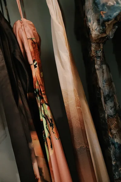
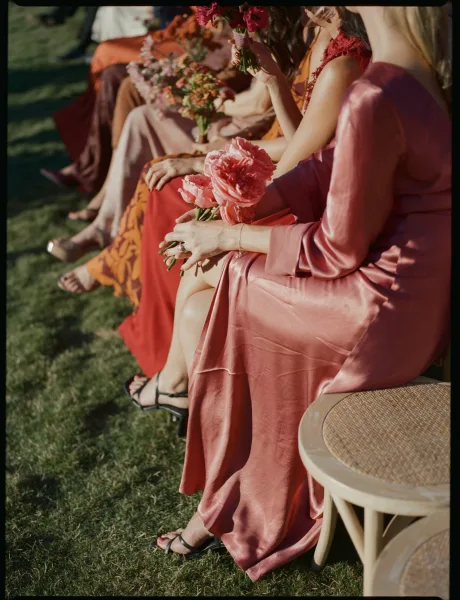
The boho aesthetic and the mismatched approach are a natural fit, since both prioritize a relaxed, collected, individual feel over uniformity. A boho mismatched party leans into earthy palettes, varied textures, and flowing silhouettes, often combining warm neutrals and terracotta tones with mixed chiffon and lace. The result reads organic and unstudied, exactly the quality boho weddings are built around.
For a boho-leaning mismatched party, earthy and muted palettes work best, drawing on warm tones and soft textures. See boho bridesmaid dresses and terracotta bridesmaid dresses for palette and silhouette direction.
Fall and Seasonal Palettes
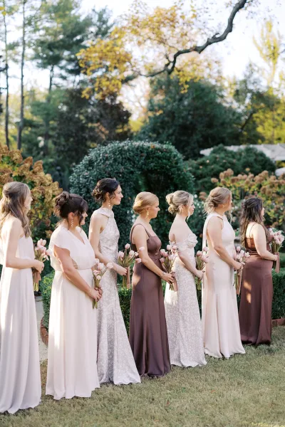
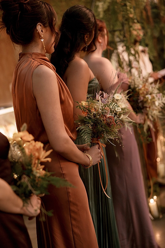
Mismatched parties adapt naturally to the seasons through palette. Fall mismatched lineups combine warm, rich tones such as burgundy, rust, terracotta, and deep green for a layered autumnal look. Winter palettes lean into jewel tones and velvet textures; spring and summer into soft pastels and lighter fabrics. The seasonal palette gives the party its cohesion while the varied dresses keep it from looking uniform.
For a fall party, deep and warm shades anchor the mix well. Browse burgundy bridesmaid dresses and rust bridesmaid dresses for autumnal palette direction, and mauve bridesmaid dresses or dusty rose bridesmaid dresses for softer, transitional schemes.
How to Coordinate Without Matching
The practical mechanics of a successful mismatched party come down to a few rules. Set the boundaries for your bridesmaids: give them the palette and the consistent element, then let them choose within it, rather than leaving the field fully open. Match every gown to physical swatches rather than color names, since shades vary between lines. And consider ordering from a single designer or line where possible, which keeps fabric weights and dye lots consistent even across different styles.
Balance matters in the final lineup. Distribute colors and prints evenly across the party for photographs rather than clustering similar dresses together, and if the group is large, repeat each shade so no single bridesmaid stands alone in her color. These small coordination choices are what separate a mismatched party that looks designed from one that looks accidental.
Letting Bridesmaids Choose Within Limits
The flexibility of a mismatched party is its main practical advantage, and it works best with structure. Rather than leaving the choice fully open, give each bridesmaid the palette and the consistent element, then let her select a silhouette and neckline that flatters her within those bounds. This is what makes mismatched so well suited to a party with a range of body types: each person wears a cut she feels confident in while the group still reads coordinated.
The same flexibility helps with budget and reuse, since bridesmaids can choose dresses at different price points and pick something they may wear again. Setting clear boundaries, the colors, the general length, and where to order, prevents the freedom from tipping into a lineup that looks accidental rather than designed.
How Mismatched Parties Read in Photographs
A mismatched party lives or dies in the group photographs, so planning the lineup with the camera in mind matters. The reliable rule is to distribute colors and prints evenly across the party rather than clustering similar dresses together, so the eye reads balance rather than two halves. A florals-and-solids party looks best alternated, and a multi-color party benefits from spacing each shade across the group.
For larger parties, repeating each color two or three times keeps any one bridesmaid from standing alone in her shade, which can look unintentional in photographs. A shared element visible in every frame, whether matching bouquets, a common metallic, or a consistent shoe, reinforces the cohesion the varied dresses might otherwise lose at a distance.
Common Mistakes to Avoid
The most frequent mismatched misstep is choosing colors without a shared undertone, so a warm peach and a cool lavender end up clashing rather than coordinating. Staying within one undertone, all warm or all cool, or one saturation level keeps the palette reading as a family. The second common error is leaving the choice entirely open, which produces a lineup with no connecting thread.
Matching to color names rather than physical swatches is another reliable source of disappointment, since the same name varies between lines. Ordering swatches, confirming the shades together, and keeping one consistent element across every look resolve the great majority of mismatched problems before they reach the aisle.
Styling a Mismatched Bridal Party
Because a mismatched party already carries variety in the dresses, accessories are best kept consistent to pull the look together. A shared metallic for jewelry and shoes, a single bouquet style across the party, or a common hair-and-makeup direction all reinforce cohesion. The bouquets in particular can tie a multi-color party together by repeating each dress shade across the florals.
Mismatched is less a color than a method, so it connects to every palette in the collection. Use this page as the hub and follow the links above into each individual shade to build a party one color at a time, then find designers and salons through the bridesmaid dress vendors directory.
Frequently Asked Questions
What does mismatched bridesmaid dresses mean?
It means the bridal party wears dresses that vary in color, shade, fabric, or silhouette rather than one identical gown. The four main approaches are same color in different styles, different shades of one color, different colors in one palette, and mixed fabrics or prints. The goal is a coordinated look, not a random one.
How do you make mismatched bridesmaid dresses look cohesive?
Keep at least one element consistent across every look, whether that is the color family, the fabric, the dress length, or the designer line. Choose a palette of two to four colors that share an undertone, match gowns to physical swatches rather than color names, and distribute the colors evenly across the party for photographs.
How many colors should a mismatched bridesmaid party use?
Most parties use two to four colors that share an undertone or saturation level. A smaller party can carry distinct colors, while a larger party usually looks best repeating a few shades across the group so no bridesmaid stands alone in her color. Staying within one color family is the easiest approach.
Is it cheaper to do mismatched bridesmaid dresses?
It can be, because it gives bridesmaids flexibility to choose styles at different price points and to pick something they may wear again. The main benefit, though, is flattering a range of body types and letting each person feel comfortable, since they are not locked into a single silhouette.
Can you mix prints and solids in a mismatched bridal party?
Yes, and it is one of the most effective techniques. Pair solid-color dresses with a coordinating floral print, pulling the print's colors from the same palette as the solids. This adds pattern while still suiting bridesmaids who prefer something plainer, and it reads especially well at garden and romantic weddings.