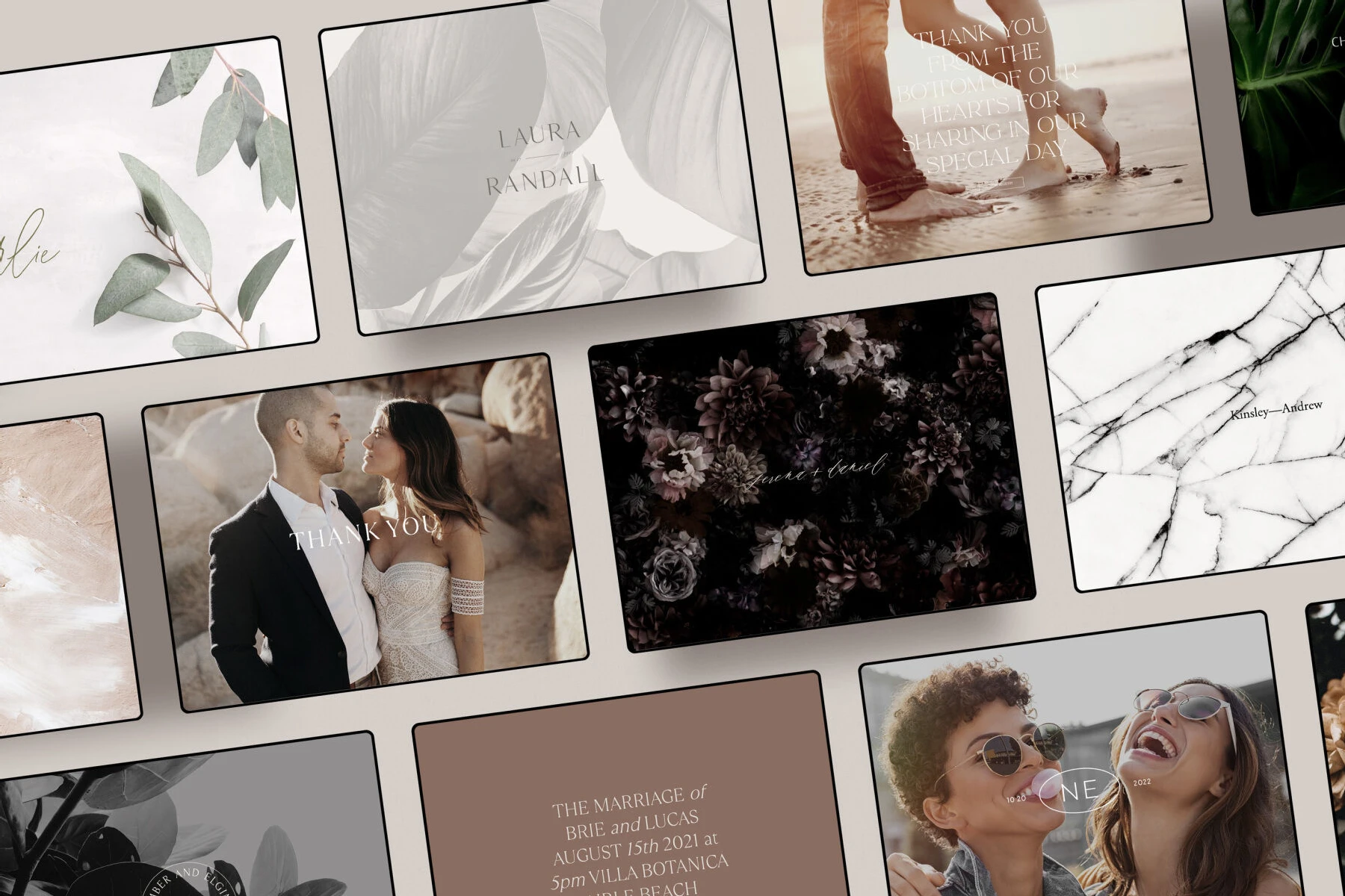
Wedding Website Examples: A mobile display of a vineyard-inspired wedding website with vines and a marbling pattern.
SPOTLIGHT

15 Wedding Website Examples—and How to Tie Them Into Your Wedding Theme

High Tech Meets High Design
C&C EDITORS / 07 14 22

With so many components leading up to, and sometimes after, your wedding day, there’s a lot your guests need to know. Which is why wedding websites have become an essential online hub that helps couples and their guests stay organized and informed of all the details about your big day. But while having a handy wedding website allows you to streamline some of the most important parts of planning for your wedding, you shouldn’t have to compromise on design, considering how much time and effort goes into the overall design and aesthetic of your wedding day. The ideal is to have a cohesive design plan that extends from your invitations to your website to your reception. Seeking inspiration from excellent examples of wedding websites can give you an idea of how to create your very own. 

By looking at our wedding website examples and integrating your wedding website with your overall wedding theme, you can showcase your curated designs to your guests while enjoying the benefits of modern technology for your wedding day arrangements.

Below you’ll find some of our favorite examples of wedding websites and see how they can fit into the context of various wedding themes, so that you can get an idea of how to create your own custom wedding website that fits into your design plan.  

And in case you hadn’t heard, you can actually create and customize your wedding website on Carats & Cake! We’re constantly inspired by the real weddings on our site in everything we do, which is why you’ll see how beautifully and seamlessly these wedding website examples can tie in with the design details of each event. We’ve matched 15 of our favorite examples of wedding websites with photos from our library of wedding galleries to get you started designing your own. 

How do you choose one of the best wedding websites?

While your website may feel like one small part of your wedding, the first step in having a cohesive theme is taking into account the color palette and design plan for your stationery, flowers, and other decor. That way, your guests feel like they’re “inside” your invitation and your website on the big day! Wedding website templates are often the foundation for creating one-of-a-kind designs. 

These customizable wedding websites examples help you avoid the more “cookie-cutter” aesthetic, and demonstrate how to make a high-end template feel totally your own. By using our  wedding websites templates, there are plenty of ways to adjust everything to your taste and theme, from font to photos to colors. Because our wedding websites examples are all inspired by real weddings, they easily integrate into a variety of event designs. Coordinating wedding websites designs with the appropriate color scheme and vibe creates a cohesive look for the entire wedding celebration. 

But how do you choose? Here are some key steps to selecting from the many wedding websites examples to find the perfect one for your event:

Confirm your Color Palette:

If you and your partner (or wedding planner) have already settled on a color palette for your decor and floral design, incorporating this color scheme when building your wedding website will often tie together these disparate elements of your wedding plan. Checking out examples of wedding websites will often give you an idea of what colors work well together and which colors to avoid when building your site and coordinating with other aspects of your reception and ceremony.

Take Inspiration from Your Venue:

Location is one of the key factors to keep in mind when choosing themes for wedding websites, since it’s the backdrop that sets the tone for every aspect of your celebration. If you are planning to get married on the beach, for instance, featuring a beach background or beachy colors for your wedding website and invitations can give your guests a sense of what your overall aesthetic will be. Or if your hotel wedding venue has a distinct lobby design, that can be a great source of inspiration. Checking out examples of wedding websites to see which ones remind you of the look or feel of your venue is a great place to start. 
Coordinate with your Wedding Stationery:

Your wedding invitations are your guests’ very first introduction to your event design, and wedding websites shortly follow suit, which is why Your wedding website should feel like an online extension of a printed invitation, setting the stage for the aesthetic of the big event to come. Many of our favorite wedding website examples take their cues directly from designs for wedding invitations, so they feel like a natural evolution. Which makes it much easier to tie in the perfect invitations with the most beautiful wedding website design for your once-in-a-lifetime event. Viewing these examples of wedding websites and invitations together can inspire you to create your own unique version and get creative. 

Consider RSVP’s:

In some cases, finding the features and functionality you need can be a matter of choosing the right wedding website provider and looking at their examples of wedding websites created using their system. Making sure your website offers the ability to track RSVPs, for example, can streamline the process of accepting responses, managing catering choices, and handling many other aspects of your wedding. Figuring out what features are the most important to you and your partner can provide real help in creating a custom wedding website that is ideally suited to your needs.

Plan Your Communication:

While creating a beautiful and easy-to-use wedding website is a top priority, it also needs to enable you to communicate with your guests efficiently. Whether that’s an easy-to-update builder so that you can tweak event details as they are finalized, or the ability to send emails, figure out which communication options are most appealing to you. Look for examples of wedding websites with your preferred communication options that also offer high-end, customizable design so that you can create a site that has everything you need.

Customize Your Favorite Wedding Websites Examples:

Our extensive lineup of examples of wedding websites provides inspiration for the different ways you can add special touches to your own site—but they’re also completely customizable. Whether you want to design and add a custom monogram, or choose a slightly different color-combination, the choice is yours. Look for a few wedding websites designs that you love, then add your own unique flair to your finished product. Engaging and appealing websites make such a big difference when it comes to your guests’ experience. Wedding websites examples that show how other couples customized the various templates and designs is a great place to get great ideas: Do you want to be able to upload photos of yourselves and your wedding party, or add a custom map that your invitation designer has created? Both are great ways to make your site feel personal.

Look for Other Functionality Features:

If you are expecting guests traveling from other countries or who may be more comfortable speaking a language other than English, some wedding website providers offer support for multiple language options. For bilingual wedding parties, be sure to check that your wedding website offers the language services that you need–and that their wedding website templates use fonts that include any necessary special characters.    

Wedding websites examples are the best place to start getting ideas for how to integrate design and technology for your wedding day. Look for templates that fit with your overall wedding theme, or that reflect your venue, interests, or general style. Seeing example wedding websites that fit seamlessly into other couples design plans can help you to create the perfect designs for your own unique website. And from there, you can look through the many wedding websites templates and get started on creating your very own.

How do you find wedding website templates that work with your overall design?

The beauty of a fully customizable wedding website design is that it’s actually not that hard to  integrate it with your overall theme. Take a look at some of our favorite examples of wedding websites that are available on Carats & Cake, and see how cohesively they fit with the designs we’ve paired them with—from the flowers to the stationery to the tablecloths. The patterns and colors of each of these wedding website examples is consistent throughout—or they take inspiration from the wedding venue or location, creating an unforgettable and unified look for the entire celebration.

So if you’re feeling overwhelmed by all the templates out there, pay attention to how these wedding websites examples coordinate with the design details of each wedding, and look for overall themes that resonate with you—you may even see elements that are already part of your design plan! 

All-Things Autumnal: 

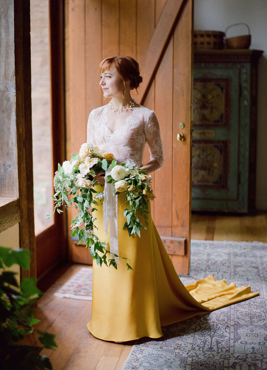
For a classic, yet memorable look, the chestnut-and-navy hues of this wedding website sample go together with an autumnal, outdoor event. There are plenty of ways to add in these chic-yet-nature-inspired tones into your wedding day, while also giving a totally unique spin—from the color palette of the invitations to more muted orange tones in the flower arrangements, and even the bride's unique dress. This wedding website example also allows you to create your own monogram, which you can add throughout with just a few clicks.

Wedding Website Examples: A flat lay of chestnut and navy wedding invitations and stationery.
Wedding Website Examples: A bride wearing a white and marigold color-blocked wedding gown and holding her bouquet of white florals.
Wedding Website Examples: A chestnut and cream color-blocked wedding website homepage.
Wedding Website Examples: A reception bouquet with marigold-colored and white florals.
Wedding Website Examples: An arrangement of welcome bag essentials including a bottle of wine, itinerary, popcorn and more.

Real Teal: 

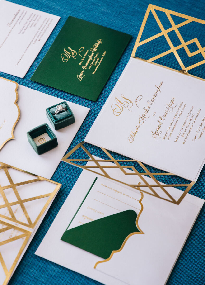
We love the look of an upscale event where green, gold, and teal take center stage, and this wedding website example ties in beautifully—especially with the watercolor-feeling of the site's backdrop, which can act as a nod to the artwork highlighted at this venue. By choosing a single color that continues from the invitation suite, to the wedding website design, all the way to the bride’s standout shoes and the reception table numbers, the consistent theme feels both contemporary and classic.

Wedding Website Examples: A teal and gold mobile display of a wedding website homepage.
Wedding Website Examples: A flat lay of teal, green, and gold wedding stationery and wedding rings.
Wedding Website Examples: A bride and groom laughing while posing in front of two art pieces.
Wedding Website Examples: A pair of teal, jewel-encrusted high heels.
Wedding Website Examples: A reception table with the number

Minimalist Marble: 

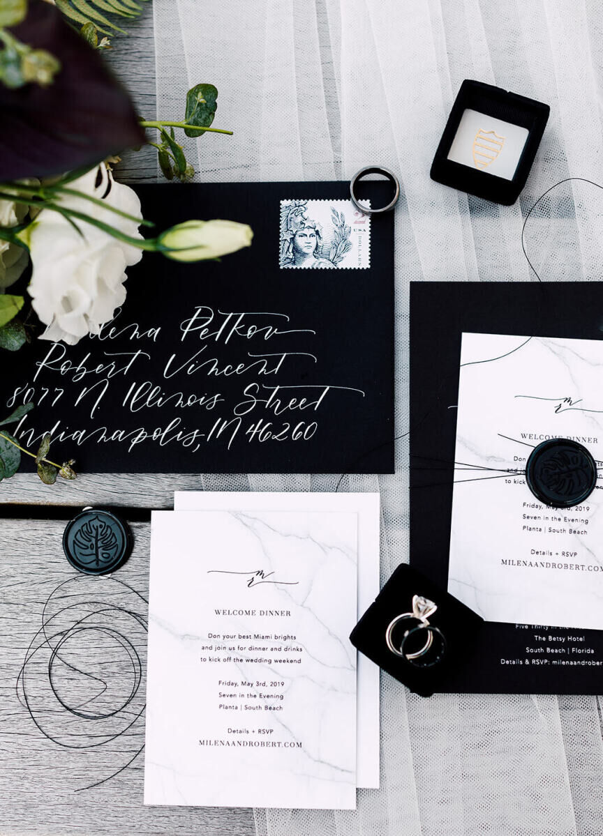
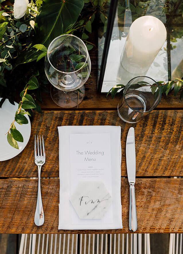
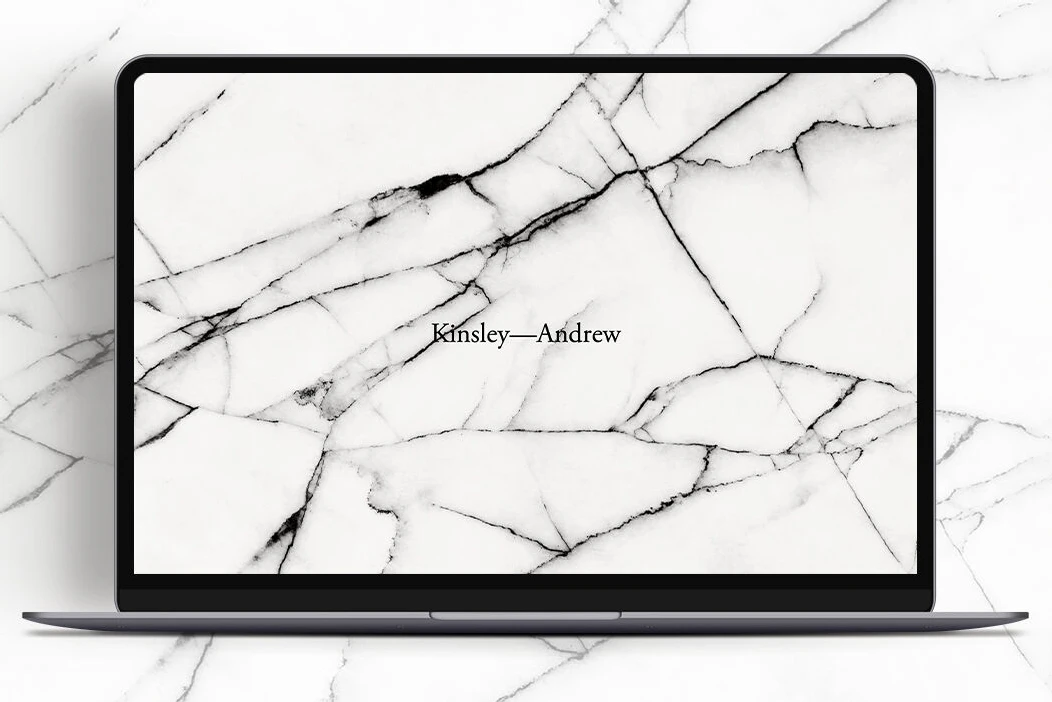
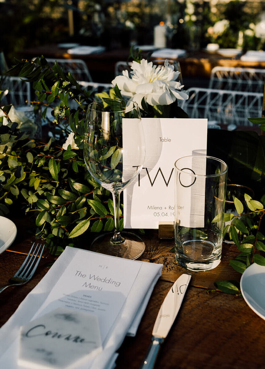
The luxe material is a favorite of ours for all elements of design. In the context of this wedding website design as well as the day-of details of this similarly-themed wedding, marbling creates an effect that’s architecturally-relevant and ultra-chic. Ideally suited for weddings with bold and black and white elements, or even a black tie affair, the modern-minimalist style is great for couples planning an industrial wedding.

Wedding Website Examples: A flat lay of black and white invitations, stationery, and wedding rings.
Wedding Website Examples: A bird's eye view of a reception table setting on a wooden table.
Wedding Website Examples: A desktop image of a marble-patterned wedding website homepage.
Wedding Website Examples: A reception table with greenery and white florals and the table
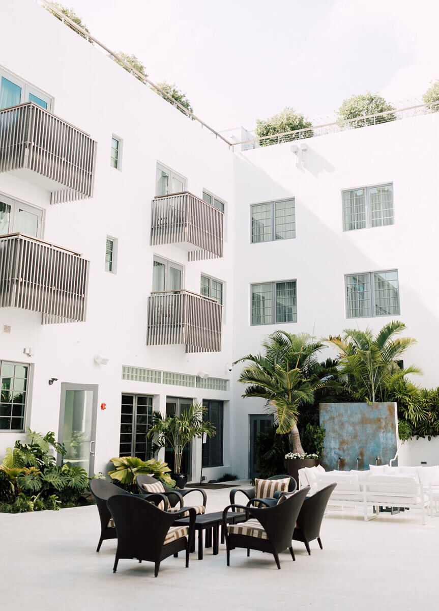
Wedding Website Examples: A courtyard at a white-painted hotel in Miami with chairs and other seating options.

Between the Vines: 

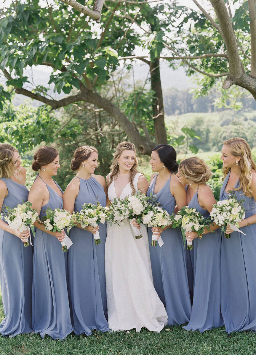
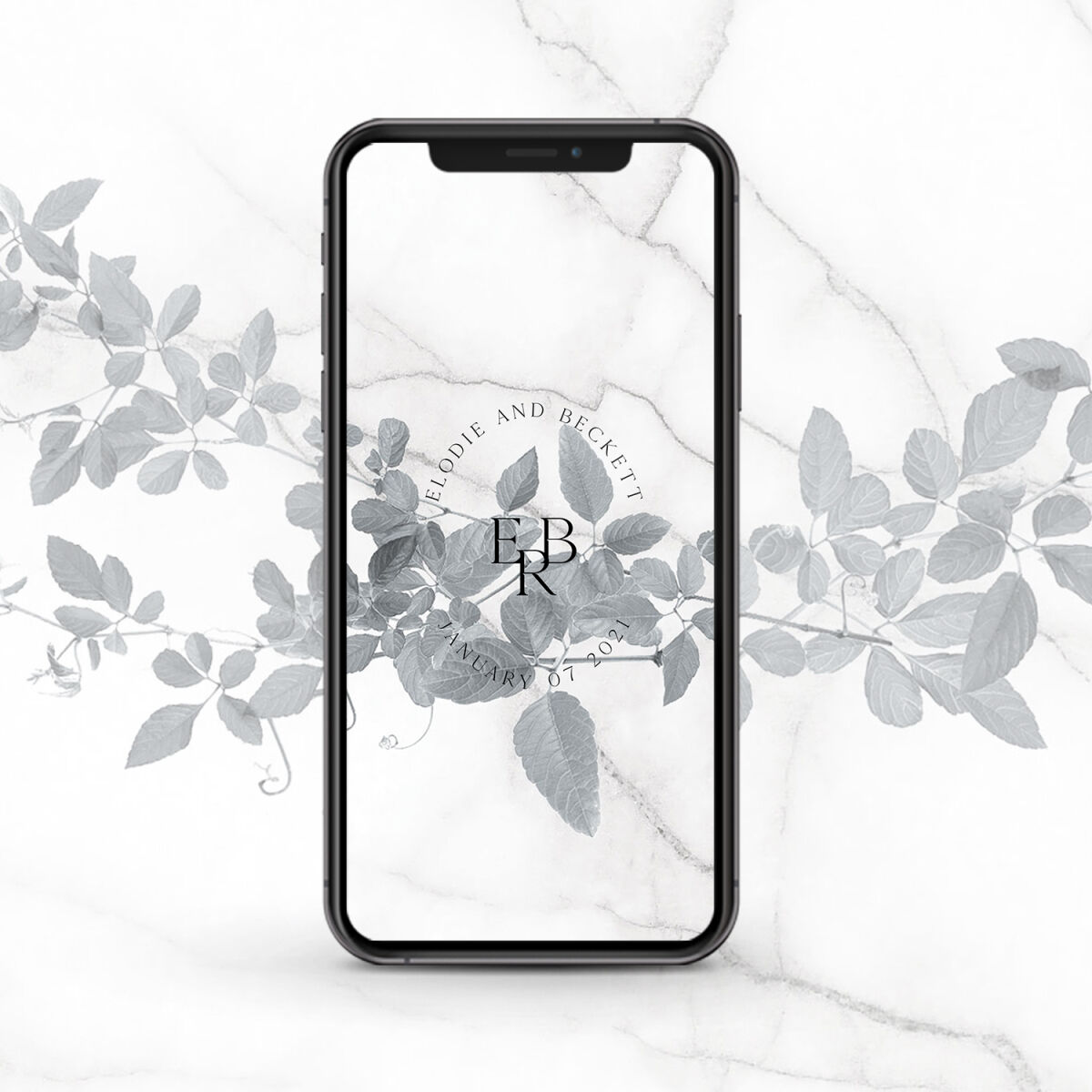
There’s a reason why so many couples are drawn to a classic slate blue color palette: it's both fresh and timeless, and so easy to incorporate into your bridesmaid dresses, table settings, and, of course, wedding website designs (we also love the color is echoed in the slate blue barn of this venue). For couples planning a vineyard or garden wedding, this combination of vines and florals match well with a spring or summer event.

Wedding Website Examples: A leaf and marble mobile wedding website design in mobile display.
Wedding Website Examples: A yellow, white and green floral arrangement at a wedding reception in Virginia.
Wedding Website Examples: The outdoor setting at Pippin Hill Farm & Vineyards in Virginia.
Wedding Website Examples: A bride posing with her six bridesmaids, who are all dressed in slate blue.
Wedding Website Examples: A close-up of a light blue -jeweled engagement ring on top of a wedding invitation.

Classic Cabernet: 

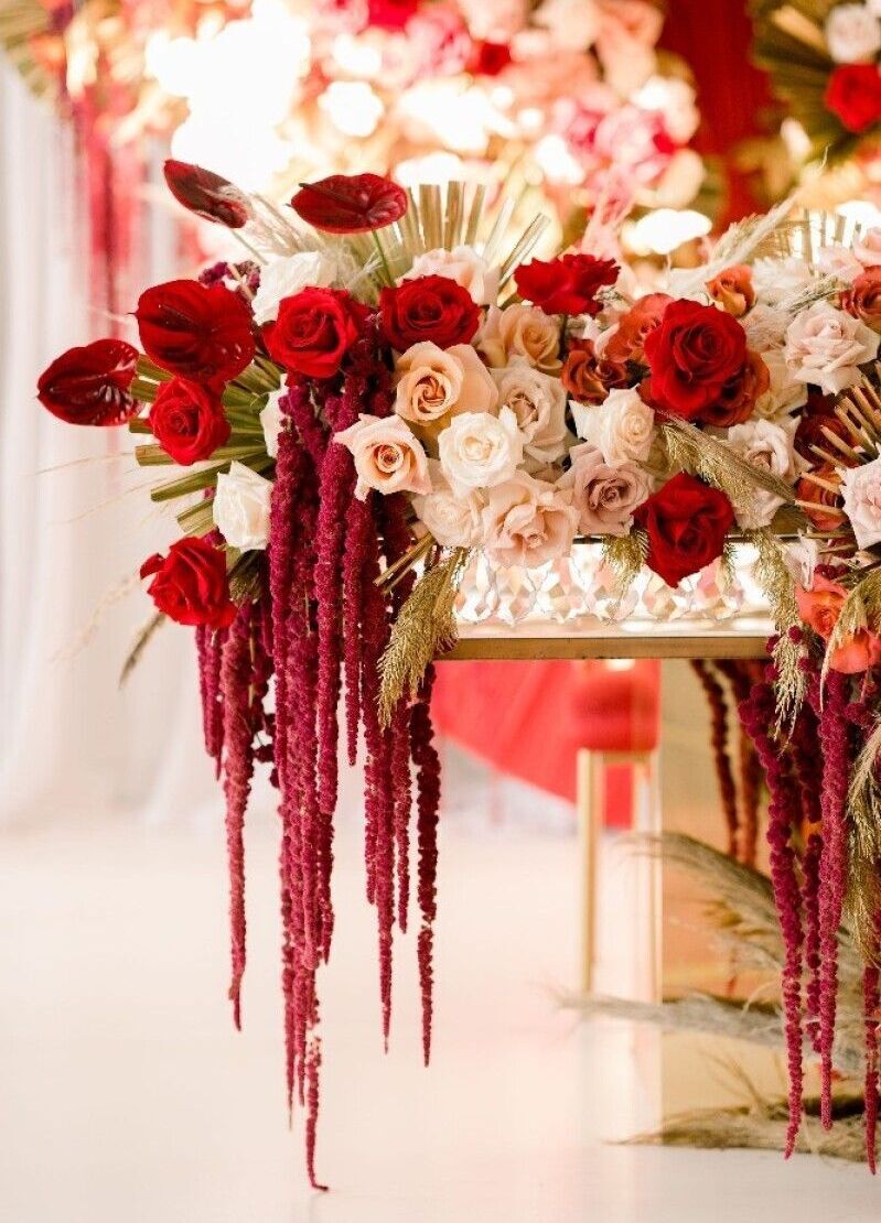
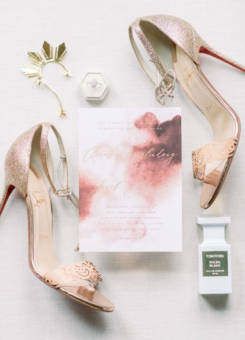
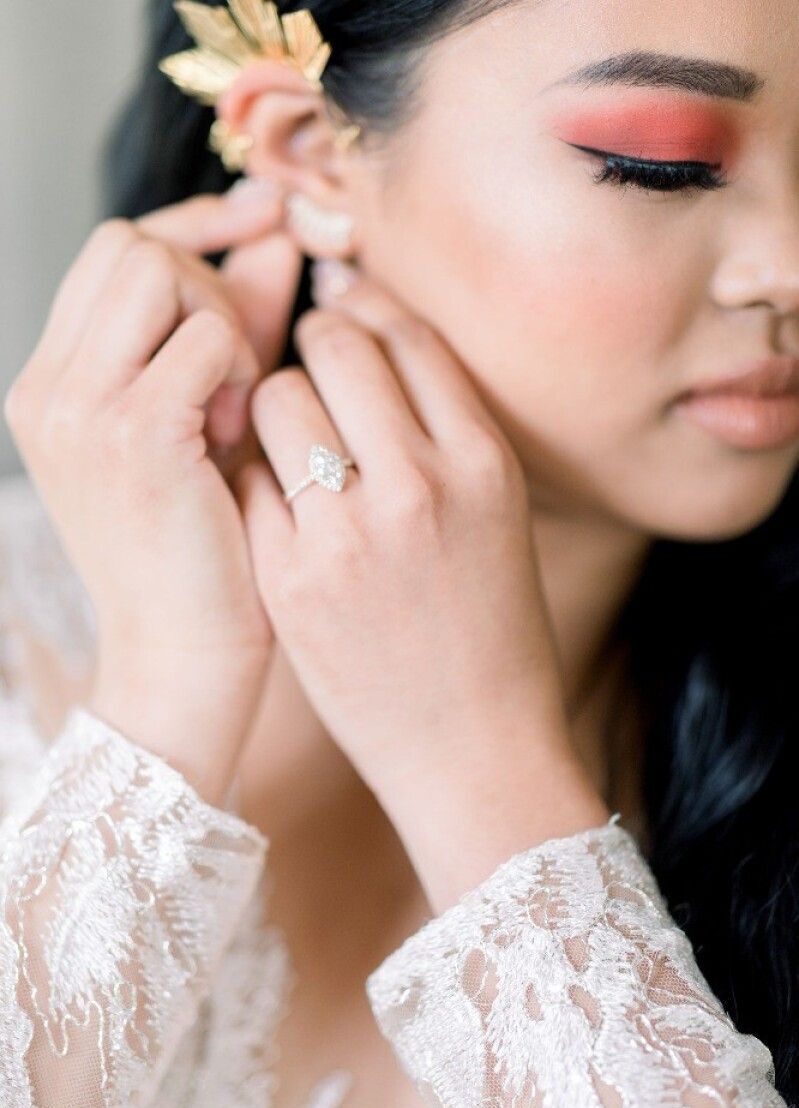
The lush and appealing look of deep reds is not for the faint of heart—but combined with blush tones, the bold wedding colors feel extra elevated. This wedding website sample feels both romantic and artistic, and is particularly fitting for a fall or winter event. With a watercolor effect and bunches of flowers featured here, this is one of the wedding website examples that truly evokes the color, vibrance, and warmth of this red-and-pink-accented event.  

Wedding Website Examples: An elaborate cream, red, and blush floral arrangement hanging over a table at a wedding.
Wedding Website Examples: A flat lay of a red and pink invitation, gold wedding shoes, perfume, an engagement ring, and more.
Wedding Website Examples: A desktop image of an artistic red and pink wedding website homepage.
Wedding Website Examples: A bride putting on her earring on her wedding day.
Wedding Website Examples: The mobile version of a wine-red wedding website.

Truly Tropical: 

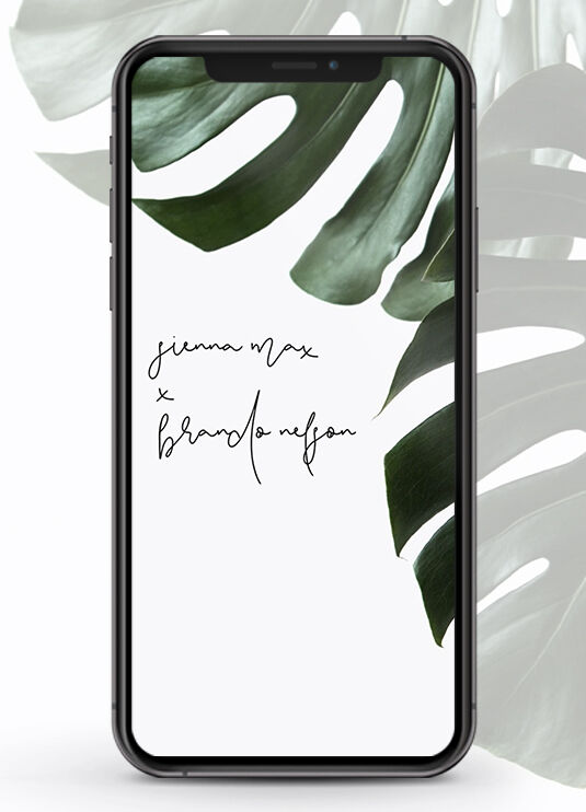
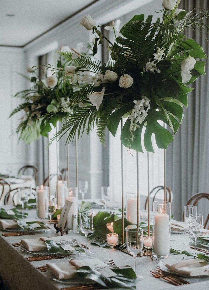
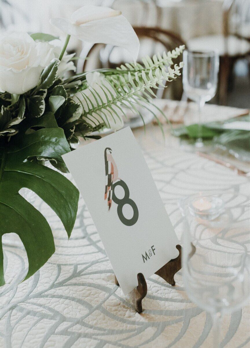
Take guests to a tropical destination from the comfort of their home with on-trend monstera leaves accenting everything from the cake to the towering table arrangements, to the perfectly complementary wedding website design. It would be a no-brainer to use this custom wedding website for an event in Hawaii, Mexico, or any other beachy locale.

Wedding Website Examples: The mobile version of a tropical leaf-accented wedding website.
Wedding Website Examples: A reception table with hanging floral arrangements with oversize tropical leaves and white flowers.
Wedding Website Examples: Another angle of wedding reception tables with oversize tropical leaves.
Wedding Website Examples: An up-close image of a table number
Wedding Website Examples: A three-tiered white wedding cake with tropical leaves and a white flower as accents.

Warm & Woodsy: 

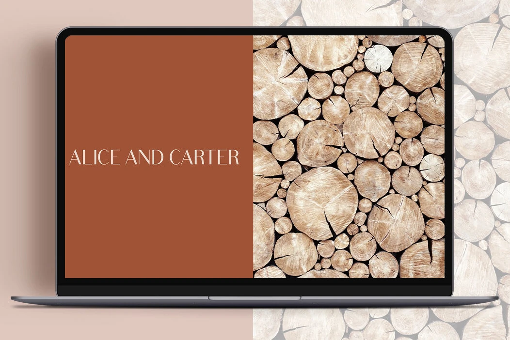
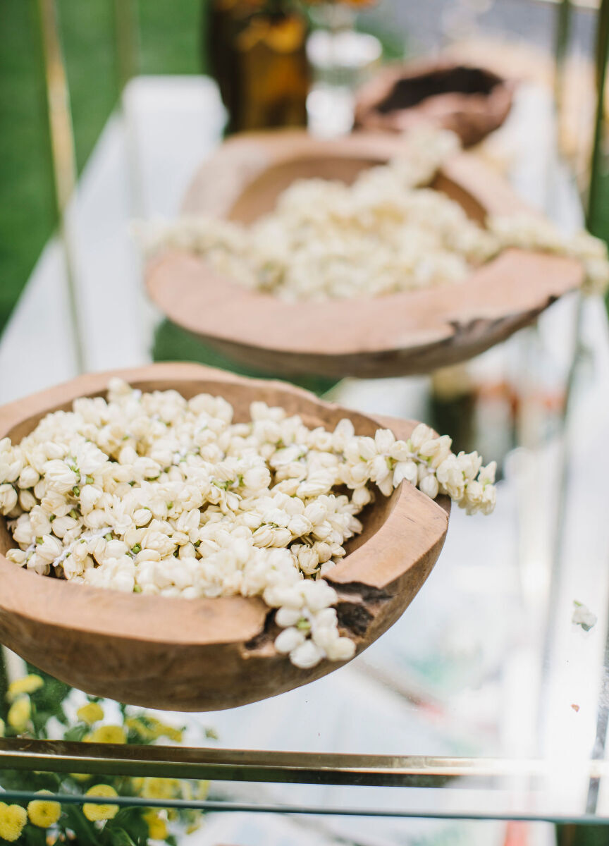
For couples planning an event with a lodge reception hall or at a rustic mountain wedding venue, this wedding website sample will truly bring your chosen space into the focus. It’s easy to see why woodsy accents and the orange and brown tones of this template provide a combination of nature and modern elegance that coordinate seamlessly with day-of details like a wooden-bound welcome book and serving bowls. 

Wedding Website Examples: A wedding couple walking on stones and away from a wood cabin.
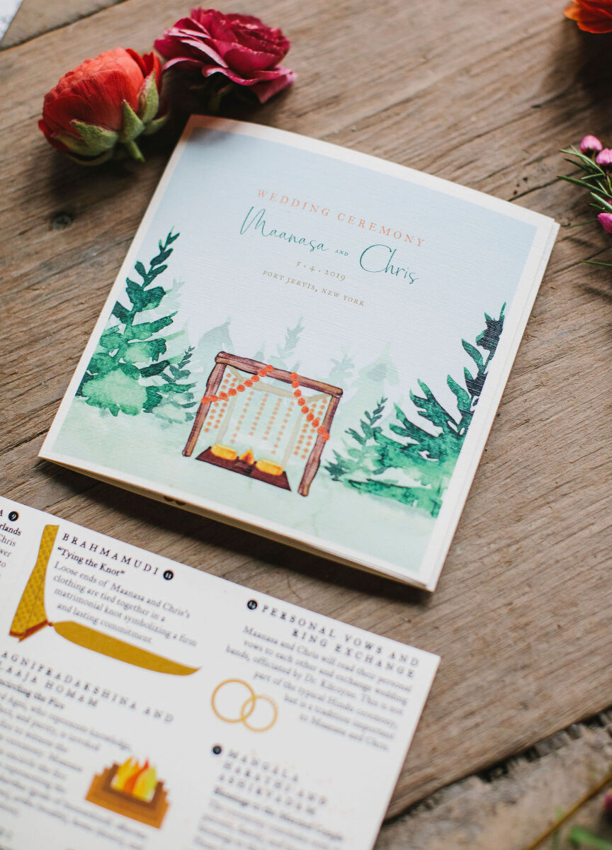
Wedding Website Examples: A flat lay of a wedding invitation and itinerary with red flower on a wooden table.
Wedding Website Examples: A burnt orange and wood-accented desktop image of a wedding website homepage.
Wedding Website Examples: White florals in wooden bowls at a wedding reception.
Wedding Website Examples: A piece of wood with the bride and grooms named, plus their wedding date engraved.

Pretty Pastels: 

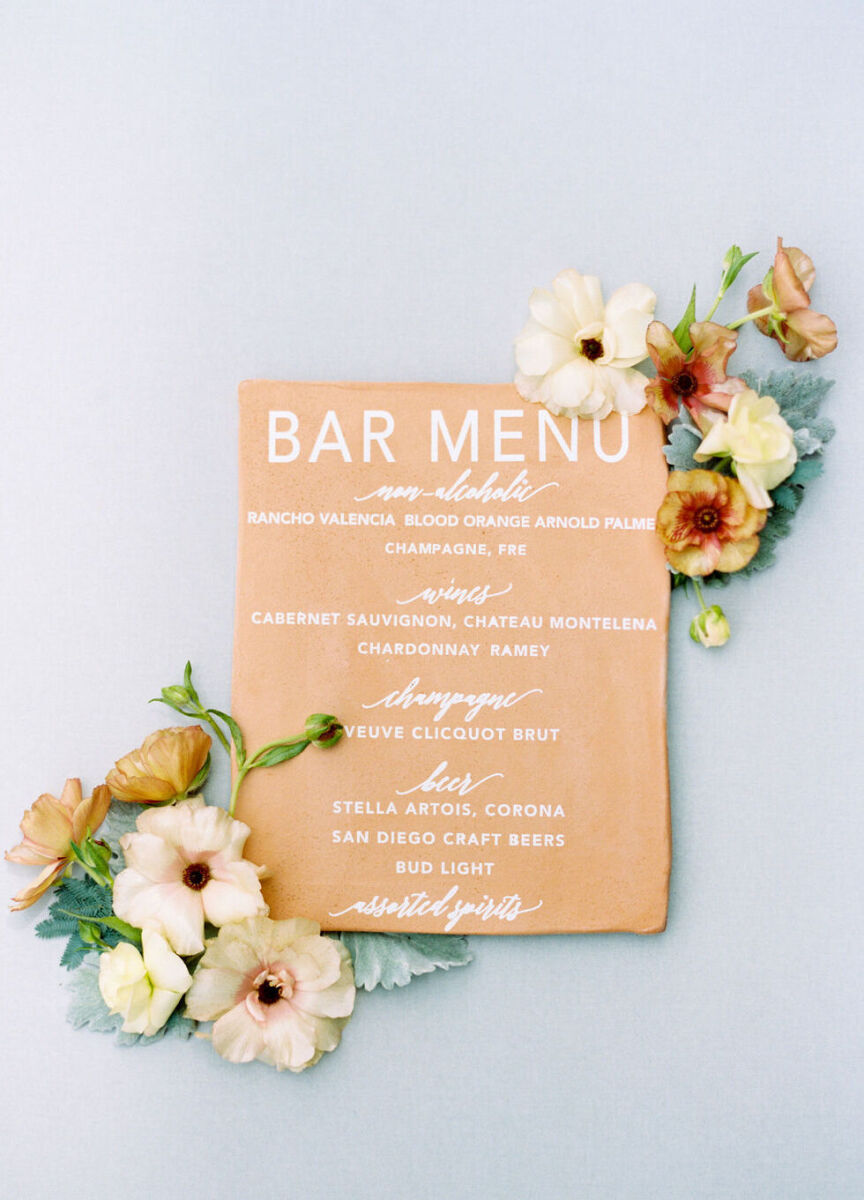
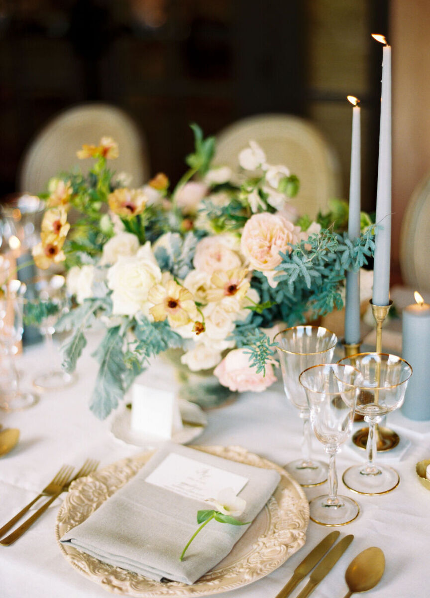
We love a pastel color palette for spring or summer weddings, but the best part is that there are so many possible color combinations to create that it always feels fresh. This wedding—as well as the wedding website example—highlight seafoam green and peach hues, an unexpected color combination that is decidedly elegant. From the candles to the menus to the bride's unique engagement ring, the muted tones match a spring wedding perfectly.

Wedding Website Examples: A mobile display of a seafoam green wedding website.
Wedding Website Examples: A seafoam green and peach reception tablescape.
Wedding Website Examples: An up-close look at engagement and wedding rings with light green roses in the back.
Wedding Website Examples: A peach-colored flat lay of bar menu with florals.
Wedding Website Examples: A mobile display of a peach-colored wedding website page.

Greenery Galore: 

While browsing through the many examples of wedding websites, there are some designs that will truly work almost any time of year, like this leafy style. Ideal for an event taking place surrounded by nature—or where you're planning to decorate everything from the ceiling of your venue to your cake with lush leaves—this wedding website example is one of the most versatile options around.

Wedding Website Examples: A flat lay of a bride and groom's rings on top of their wedding invitation.
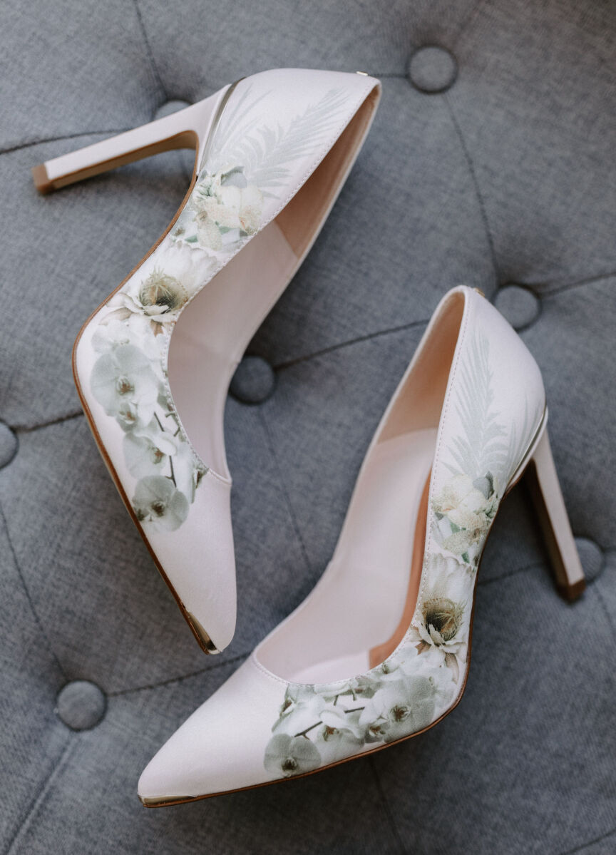
Wedding Website Examples: A pair of floral heels on their side.
Wedding Website Examples: A desktop display of a leaf-accented wedding website homepage.
Wedding Website Examples: A bride in her getting-ready robe, sitting on a couch and petting her dog.
Wedding Website Examples: A three-tiered wedding cake with leaf and floral accents.

Creative Color Contrast: 

Among all the examples of wedding websites, we love how this unusual-yet-dreamy color palette looks like it was made for this wedding design. The contrast of dark blue with a peachy pink can be incorporated into any part of your wedding decor, and it’s an unexpected color combo that will inevitably become more popular in the future.

Wedding Website Examples: A mobile display of a light pink and navy wedding website.
Wedding Website Examples: A flat lay showing a woven fan and piece of wedding stationery.
Wedding Website Examples: A modern pink, navy and white geometric installation accented with florals.
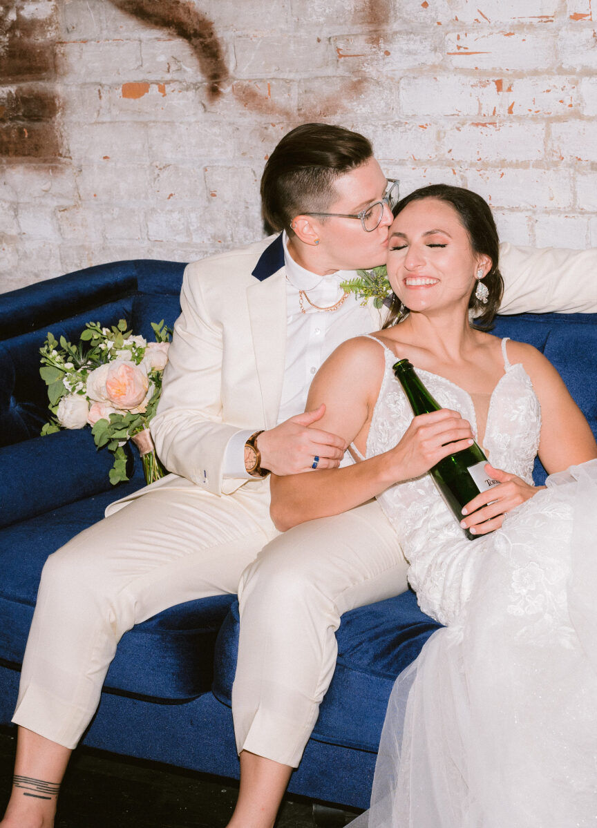
Wedding Website Examples: A wedding couple sharing a moment on a navy couch with a bouquet and bottle of wine.
Wedding Website Examples: A mobile display of a navy wedding website homepage.

Country Lilac: 

With lilac hues, a nod to nature, and other neutrals, this is one of the wedding website examples that will work with more rustic or elegant venues alike. For couples planning a garden or vineyard wedding, the unique and soft elements of this wedding website design will work seamlessly, especially if you tie in other purple tones with your flower invitation suite, bridesmaid dresses, and even the men's ties. 

Wedding Website Examples: A flat lay showing a lilac-accented white wedding invitation with an engagement ring and wedding rings.
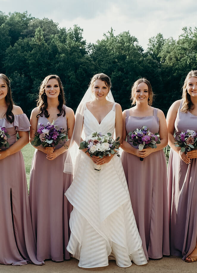
Wedding Website Examples: A bride posing outdoors with her four bridesmaids, who are all wearing lilac-colored dresses.
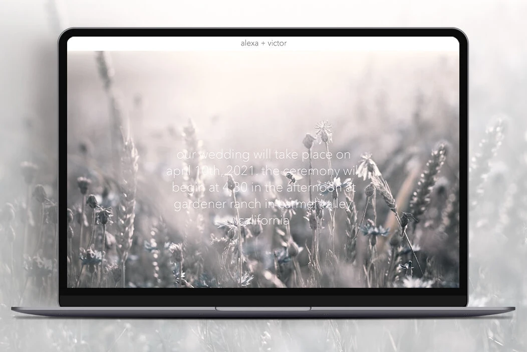
Wedding Website Examples: A desktop display of a wedding website homepage showing a meadow.
Wedding Website Examples: A mobile display of a wedding website homepage with a light gray background.
Wedding Website Examples: A wedding couple sharing a kiss in the middle of a vineyard.

Blushing Brown: 

Proof that neutrals are unique and dramatic, this collection of peach and rust tones fit well with wooden accents and trending floral accents like pampas grass. It’s a favorite among our wedding websites examples, and it’s clear why: The delicate florals and strong font create the perfect balance of providing helpful information and showcasing your and your partner’s personal style. 

Wedding Website Examples: A mobile display of a wedding website with peach and rust tones.
Wedding Website Examples: A wedding couple celebrating at their outdoor wedding ceremony, complete with a triangle-shaped wooden archway.
Wedding Website Examples: A desktop display of a delicate floral wedding website homepage.
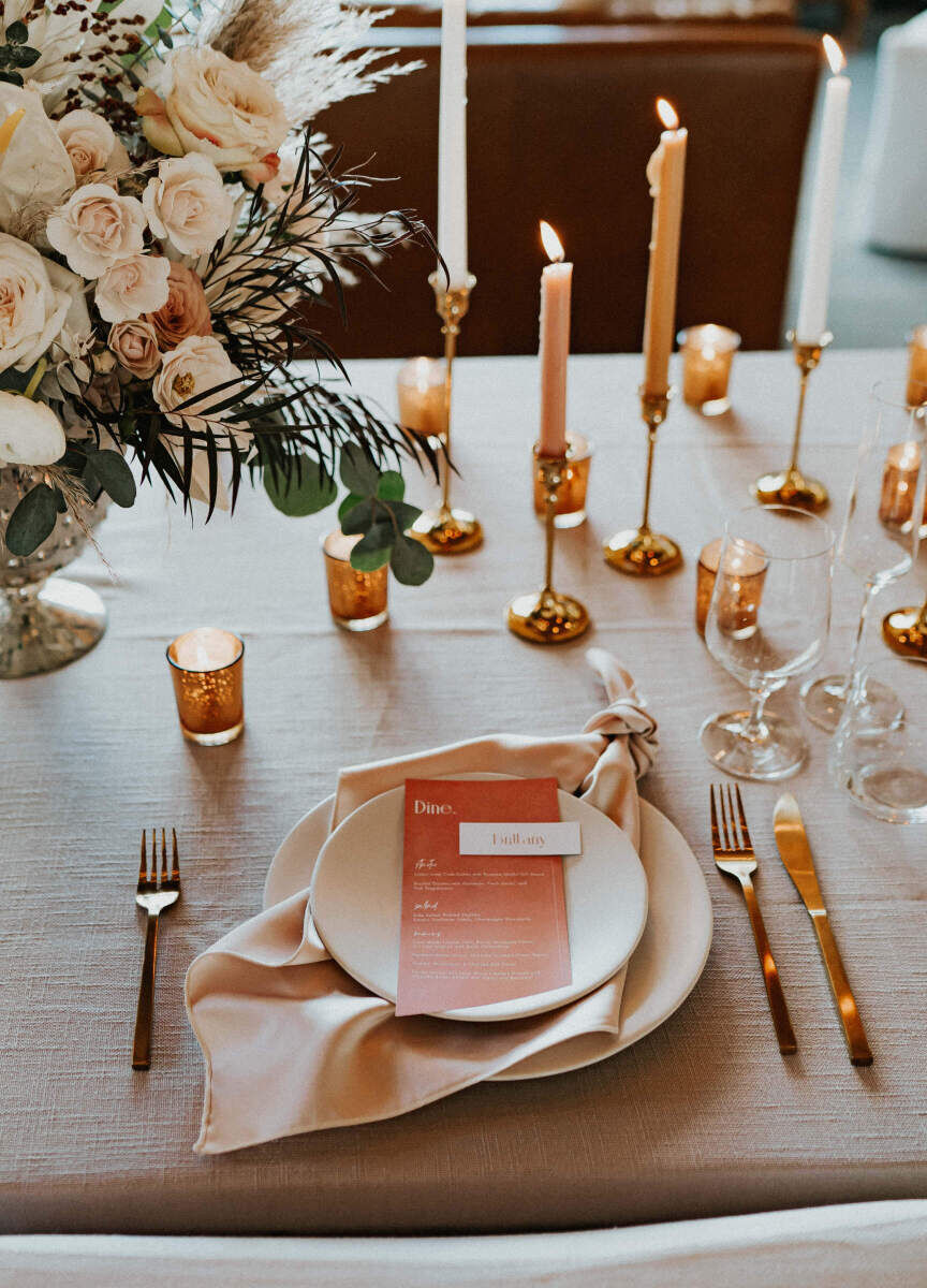
Wedding Website Examples: A pink and orange tablescape at a wedding reception.
Wedding Website Examples: A mobile display of a wedding website with brown, rust tones.

Moody Mountains: 

The beauty of nature is on full display in this particular design. Of all the wedding websites examples available, the moodiness and drama make it a great match for nearly any nature or woodsy-focused event but in a bold, graphic way. This theme complements an outdoor or mountain venue with plenty of trees and foliage.

Wedding Website Examples: A flat lay of a navy wedding invitation envelope and white wedding invitation with greenery accents.
Wedding Website Examples: An outdoor ceremony with wooden benches in the middle of a forest.
Wedding Website Examples: A desktop display of a mountain range with clouds and mist.
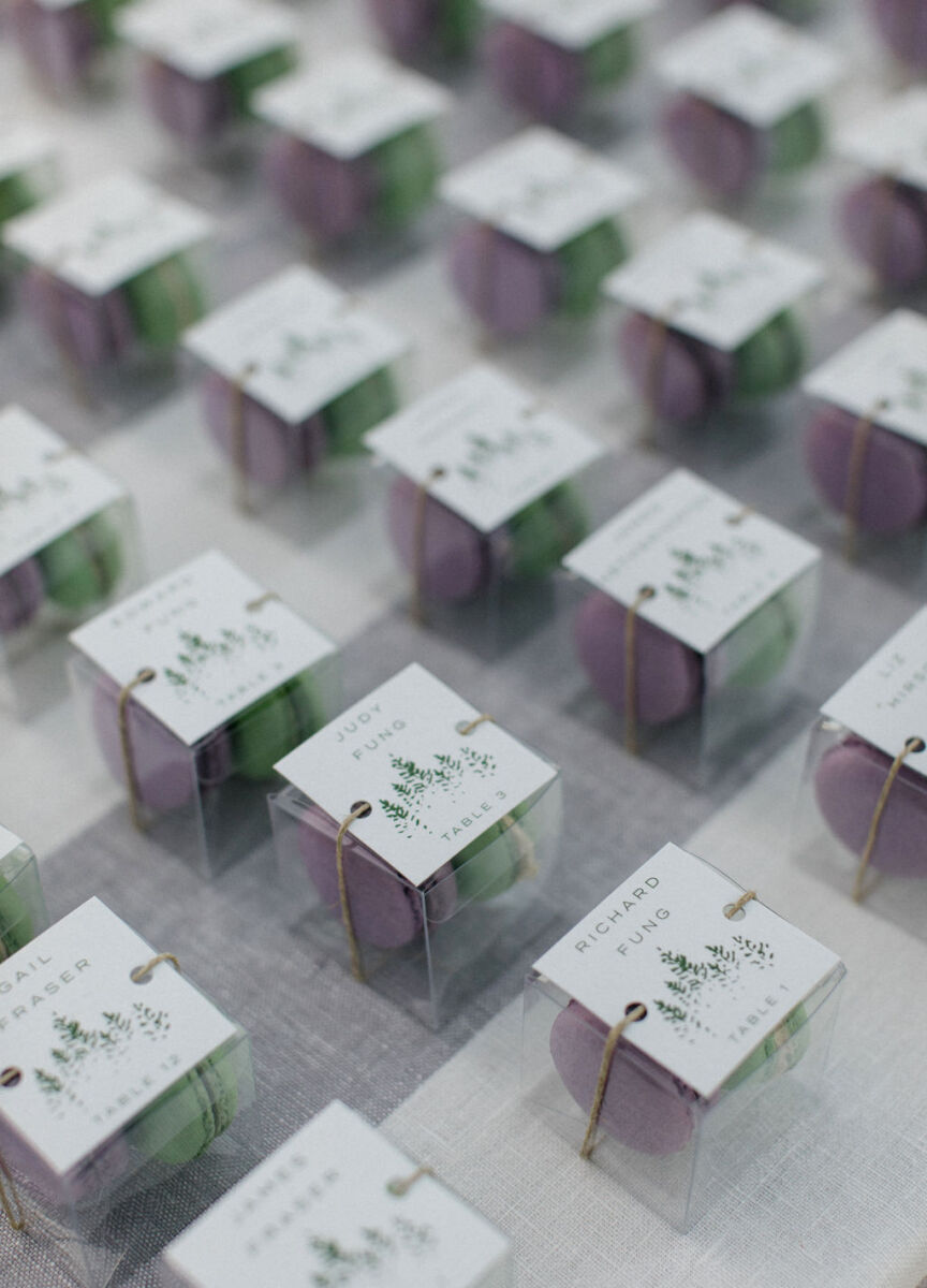
Wedding Website Examples: A collection of party favors for wedding guests: boxes of macarons.
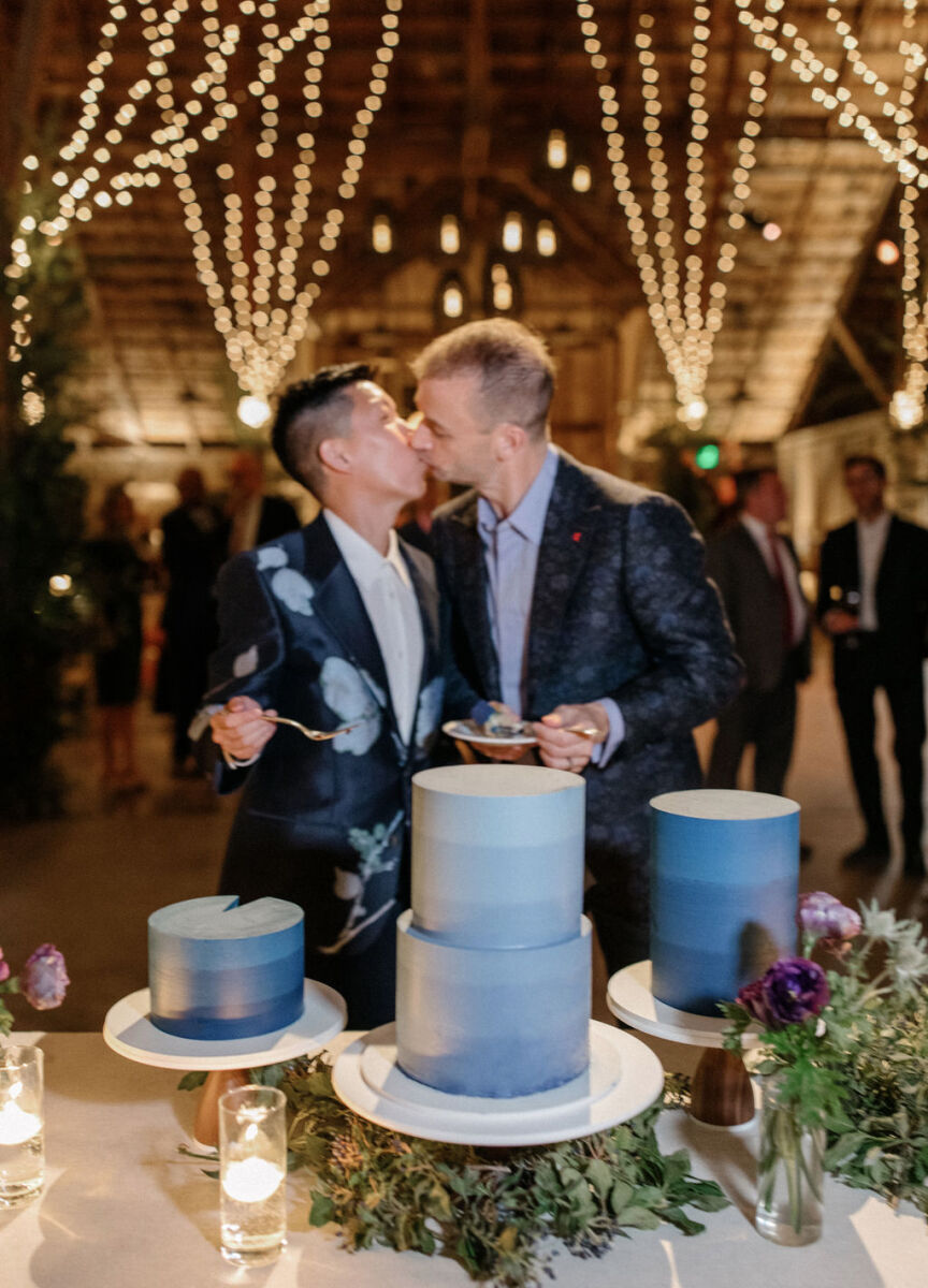
Wedding Website Examples: A wedding couple sharing a kiss by their three blue wedding cakes at an indoor reception.

Blanc Blossom:

Wedding website examples that begin and end with floral inspiration are one of the easiest designs to integrate into your event. If your big day will spotlight the simple elegance of white and green flower arrangements, then this wedding website template is a perfect match. From pops of white in a lush green ceremony arch to delicate bud vases offset by long-stemmed candles at the reception tables, we love the understated elegance of this design.

Wedding Website Examples: A mobile display of a wedding website with an oversize white flower.
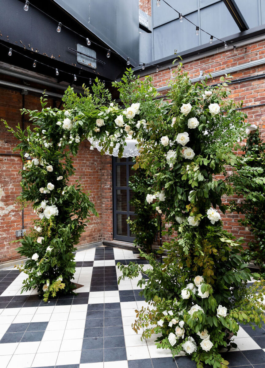
Wedding Website Examples: A wedding arch with greenery and white florals in an industrial wedding ceremony venue.
Wedding Website Examples: A wedding couple holding hands and smiling while their officiant speaks in front of a brick wall.
Wedding Website Examples: A wedding bouquet with white florals and green stems.
Wedding Website Examples: A tablescape with long-stemmed candles and small white floral arrangements.

Bold Burgundy: 

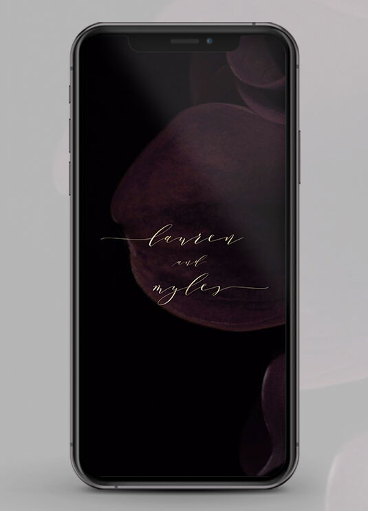
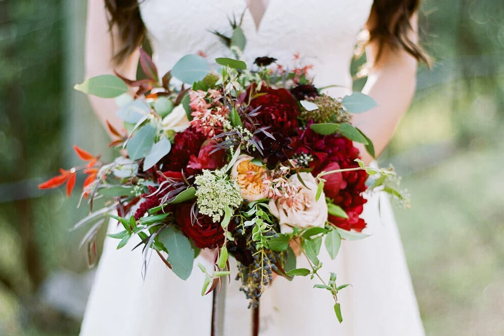
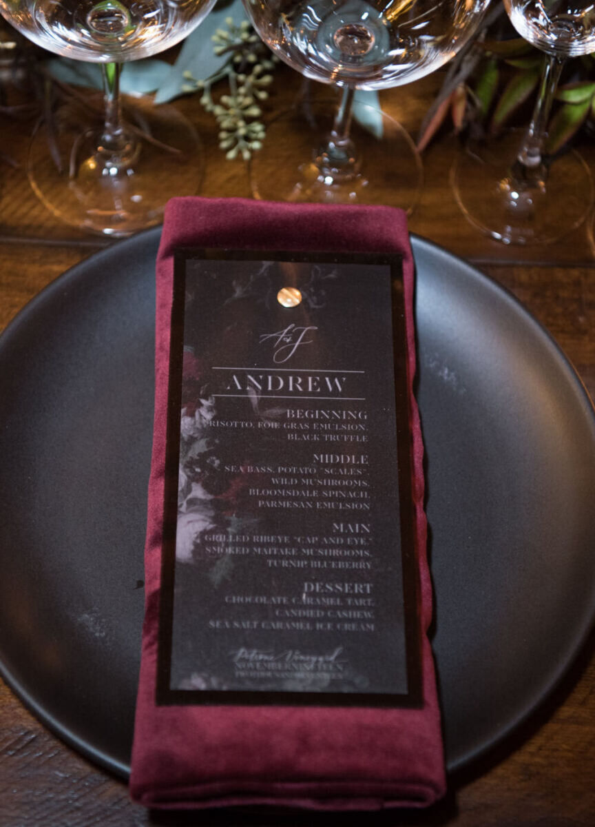
For a dramatic, winter-inspired look, look for wedding website examples that create a dark and romantic backdrop that will complement a wide range of themes and decor. With oversized florals subtly featured on the first page, it’s the ultimate backdrop for setting the overall tone and mood of your special day, which, in this case, is all about drama.

Wedding Website Examples: A mobile display showing a wedding website with subtle dark floral accents.
Wedding Website Examples: A flat lay of black and red wedding florals and stationery.
Wedding Website Examples: A bride holding a red, pink and green floral arrangement.
Wedding Website Examples: A series of cocktails with cranberries floating in them.
Wedding Website Examples: A wedding place setting with a dark red napkin and coordinating menu.

How do you build a wedding website?

Once you’ve browsed all of the wedding website templates and determined the best one for you, it’s time to customize it to make it your own. Take these ideas into account when you’re choosing your own and get as creative as you want. In general, the process of creating the best wedding websites is fairly straightforward and involves the following steps:

Find Inspiration from Example Wedding Websites:

Before deciding on a theme or look for your website, it is worthwhile to take a look at wedding websites examples to find the ones that appeal most to you and your partner—and have the functionalities that you need. By checking out our examples of wedding websites, you can gain a better understanding of what is possible and what your preferences are for your own wedding websites designs. Our wedding website samples are an excellent source of ideas for mapping out your online event hub that can be borrowed and adjusted to suit your needs. By choosing from our wedding website samples and tweaking them to fit your theme and style, you can make the best use of these wedding website examples for your own special celebration.

Select a Flexible Website Builder:

You can get a good idea about the level of customization possible by checking out wedding websites examples on various building platforms and playing around with the options in the building process. Try out different fonts and styles before determining which one you want to commit to, and upload your own photos or wedding monograms. Of course, the wedding website examples available through Carats & Cake are a great place to start. 
Choose a Custom Wedding Website URL:

Of course, the best wedding websites are the most useful to wedding guests if they have easy-to-remember domain names that are unique to the couple or the event. So don't forget to think about custom URL's during the wedding website design process that are clever and unforgettable (Note: you will likely need to purchase your custom wedding URL on another site, but can add it to your design in the final steps).
Collect Your Information:

When designing your site with wedding website templates, you will need to include detailed information to let your guests know more about your wedding plans—and you can add information about you and your partner, or wedding party as well. Particularly for multi-day events and wedding weekends, it's helpful to have the event details for each event—including dress code, transportation, etc.—all in one place. Take a look at wedding website samples to see what types of information should be included on your own site.

Design Your Website:

Creating a unique and inspiring website that ties in perfectly with your overall design plan should feel a little easier after seeing the examples of wedding websites above. Start with your color palette, design theme or location, and then look for wedding website samples that feature the same details. Then create your own digital work of art with a combination of fonts, images, and backgrounds that you can customize to your heart's content with our website builder. The highest degree of customization means the sky's the limit when it comes to fully integrating your wedding website with your event design—from choosing the same font as your printed invitations to uploading a custom logo created by an illustrator. Our easy-to-use builder allows you to add images and videos, choose the perfect fonts, and put together the best wedding website for your special day.

Create a Framework and Structure:

When organizing pages for the best wedding websites, you'll need to create sections that map out each element of your wedding plans—whether that be the ceremony time and location, transportation to the reception, and the after-party details, or a weekend full of a variety of events. But it's nice to create other areas of your website that will excite and entertain your guests as well, such as a "Things to Do" section for those traveling in from out of town—and certainly "Accommodations" that include information regarding any sort of hotel room blocks. One way to determine what all should be included in your wedding website is by reviewing your wedding planning checklist to make sure your guests have all the information they need to relax and enjoy your big day. 

Choose your Words Carefully:

In most cases, the overall look of your website should complement your wedding invitations to create a more cohesive design for these elements of your wedding stationery. But while the wording for formal wedding invitations has traditional parameters regarding the proper language etiquette, you should feel free to use your own voice when writing your wedding website—especially if you include a section about you and your partner's story. Take a look at examples of wedding websites to see how other couples have created an elegant and meaningful website that sounds just like them.

Integrate Key Features:

Once you’ve selected your favorite among the many wedding websites templates, you can check out our wedding website examples to decide which features you want to incorporate into your own. For instance, if you have a particularly bilingual wedding party, your website can be translated into most languages. Automatic collection of your RSVPs through your website can streamline the process of planning your wedding overall too. Many of the examples of wedding websites in our gallery display custom logos and monograms, and you may decide that these add-on features are must-haves for your custom site. So be sure the functionalities you need exist in the site provider that you choose, and then enjoy customizing your design to make communication with your guests that much easier. 

Test Your Website:

Whether you’re already using our website builder or just trying out different wedding website templates, it is important to test out all aspects of your website to make sure it looks and works the way it should before you share it with your guests. Having looked at the wedding website examples in advance, you'll have an idea of how your site should look. In many cases, the wedding website examples on our site feature custom wedding monograms and logos, but you'll want to make sure that the resolution is high enough and that they are scaling properly once you've uploaded them to your site. The best wedding websites are equal parts design and function.

Optimize for Mobile Devices:

All of our wedding websites examples have been designed to work with mobile devices as well as with desktop and laptop computers. The best wedding websites are optimized for mobile devices so that your guests have access to key information wherever they happen to be. 

Publish your Wedding Website:

Once your website is ready for prime time, you can share the URL with your invited guests. You can continue to update and add to your wedding website leading up to your wedding, which can allow your guests to stay informed of any necessary updates.

By starting with our wedding website examples, you can build a website that suits your needs and your theme perfectly. Our examples of wedding websites can demonstrate how to match your website to your venue, your wedding theme, and other elements of your wedding to create the perfect look for your perfect day. The best wedding website templates are within reach, and it’s easier than ever to make them truly your own.

How much do wedding websites cost?

With the average cost of a wedding estimated at $30,000 in the year 2020, the cost of your website is unlikely to make a significant difference in your overall expenditures. Although wedding costs are on the rise because of supply chain issues and increased demand, the cost of a wedding website has remained relatively stable over the past few years—and will be a small percentage of your overall budget.

One practical way to look at your expenses is to consider the various tiers of wedding sizes and costs, which range from intimate to ultra-luxury.  The price of a custom domain name might cost more than a standard URL, but it likely won’t affect your budget significantly. In fact, adding more information to your website can have an impact on your printed invitation cost, as you may not need to include as many pieces of paper.

When designing your wedding website, it is worthwhile to remember that guests spend about $1,000 on average per wedding they attend. Making sure that you provide them with all the relevant information about your wedding reception, ceremony, and other events through your website and other wedding stationery so that they can plan ahead and stay up-to-date with any and all details needed for your event.

How do you start creating your wedding website?

The first step is to start with a design idea for your overall wedding—color, theme, location, etc.—and to then look for example wedding websites that fit with your theme. Then find ways to continuously tie in the design details in every element of your wedding, from your invitations, to your wedding website, to your reception flowers and tablescapes. By choosing a website provider with high-end, high-design wedding websites to begin with and an easy-to-use website builder, you'll make the process of creating a beautiful online information hub for your guests that much easier.

Carats & Cake
Join the Community
Create An Account
Back to Login

By creating an account, you agree to our Terms of Use and have read and understood the Privacy Policy.

Back to Login
No problem! Reset your password via email.
Back to Login
Wedding Websites & Invitations